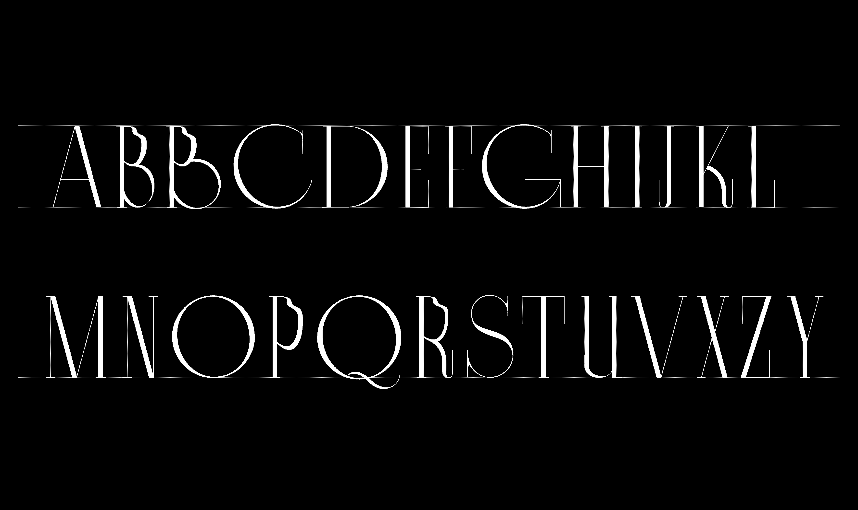
Type Design Workshop / 2021
This year TDW had a truly magical atmosphere thanks to the workshop theme “Beauty and the Beast”, where the students had to focus on the opposites and their attraction. Each of them was randomly assigned a fairy tale to use as inspiration for a variable type concept to reflect the protagonist and antagonist of the story through the contrast between construction and deconstruction.
Invited speaker: Kirill Gluschenko
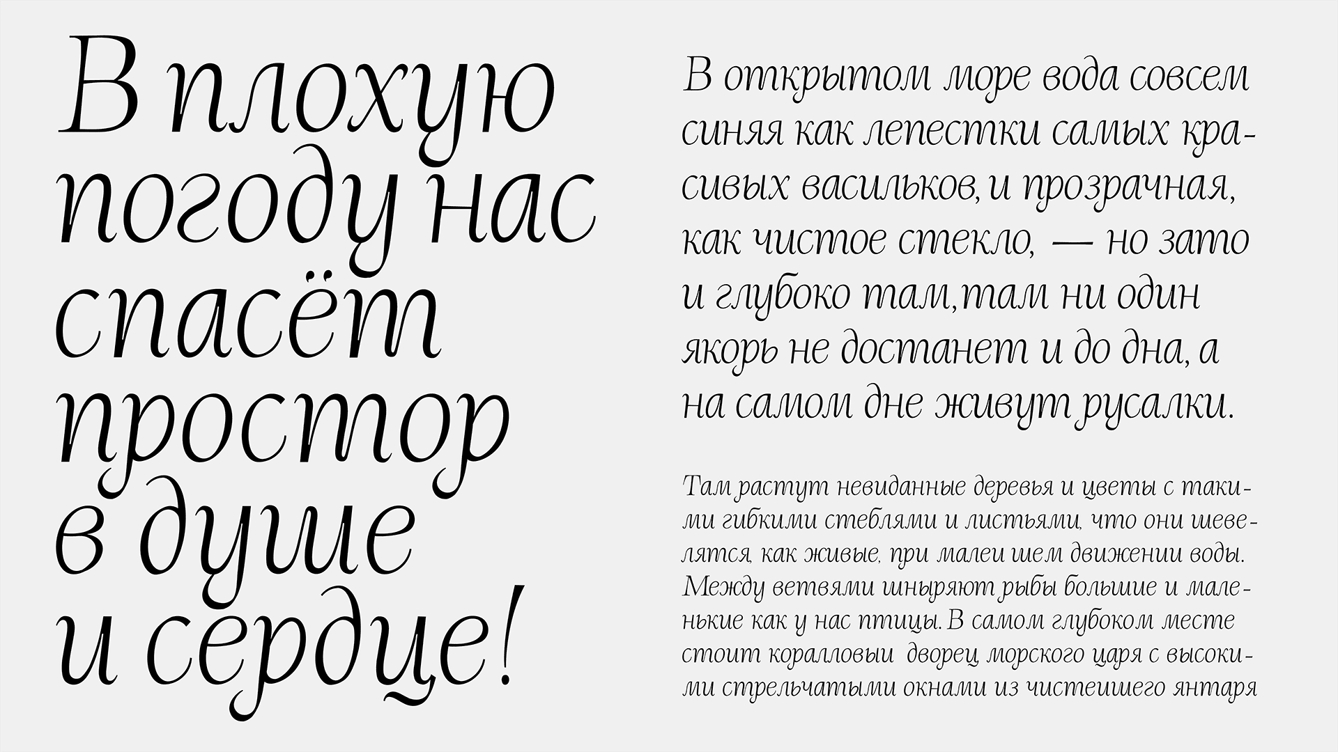
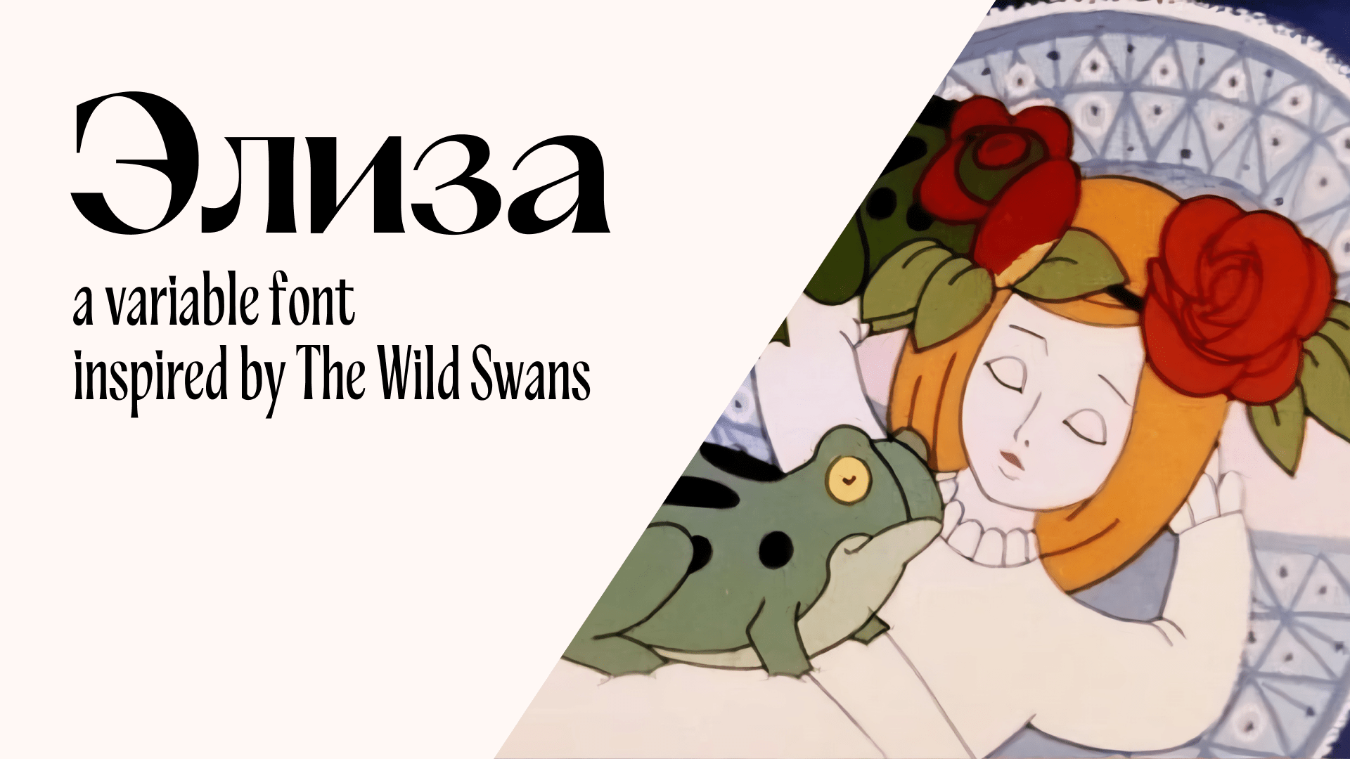
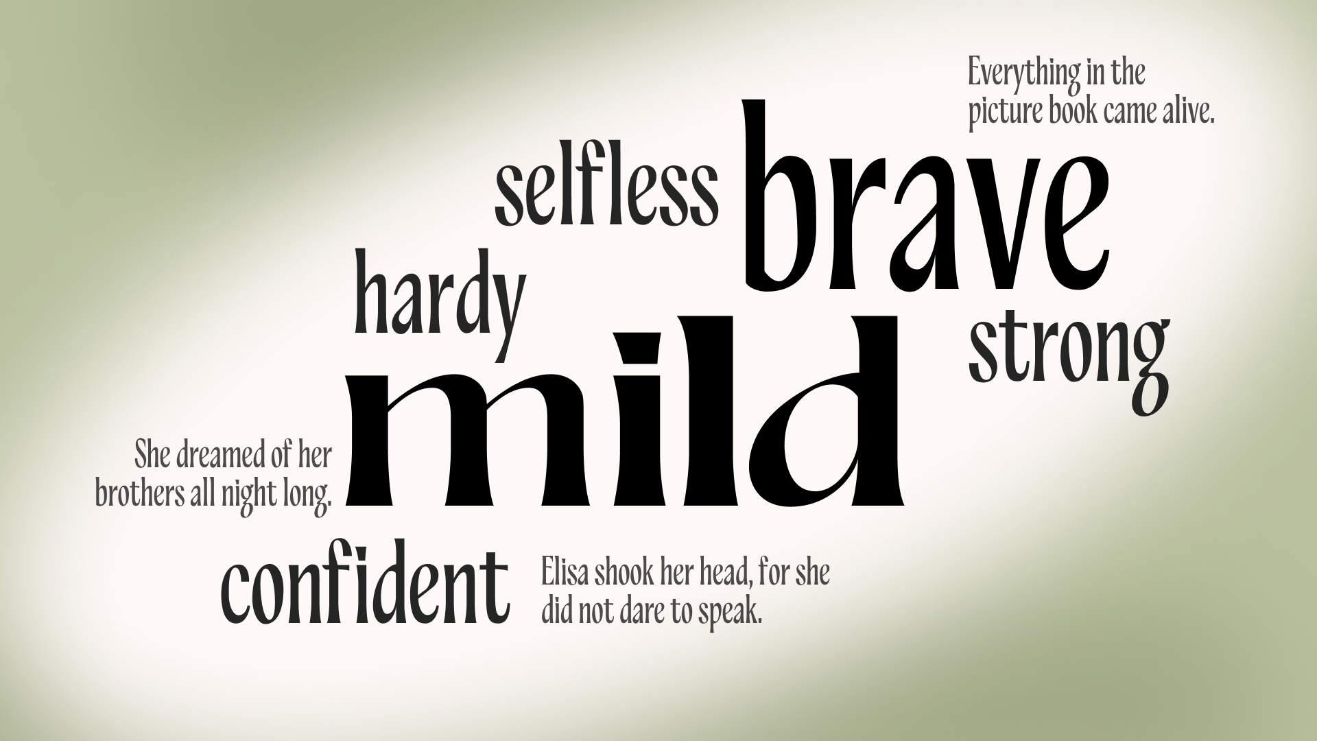
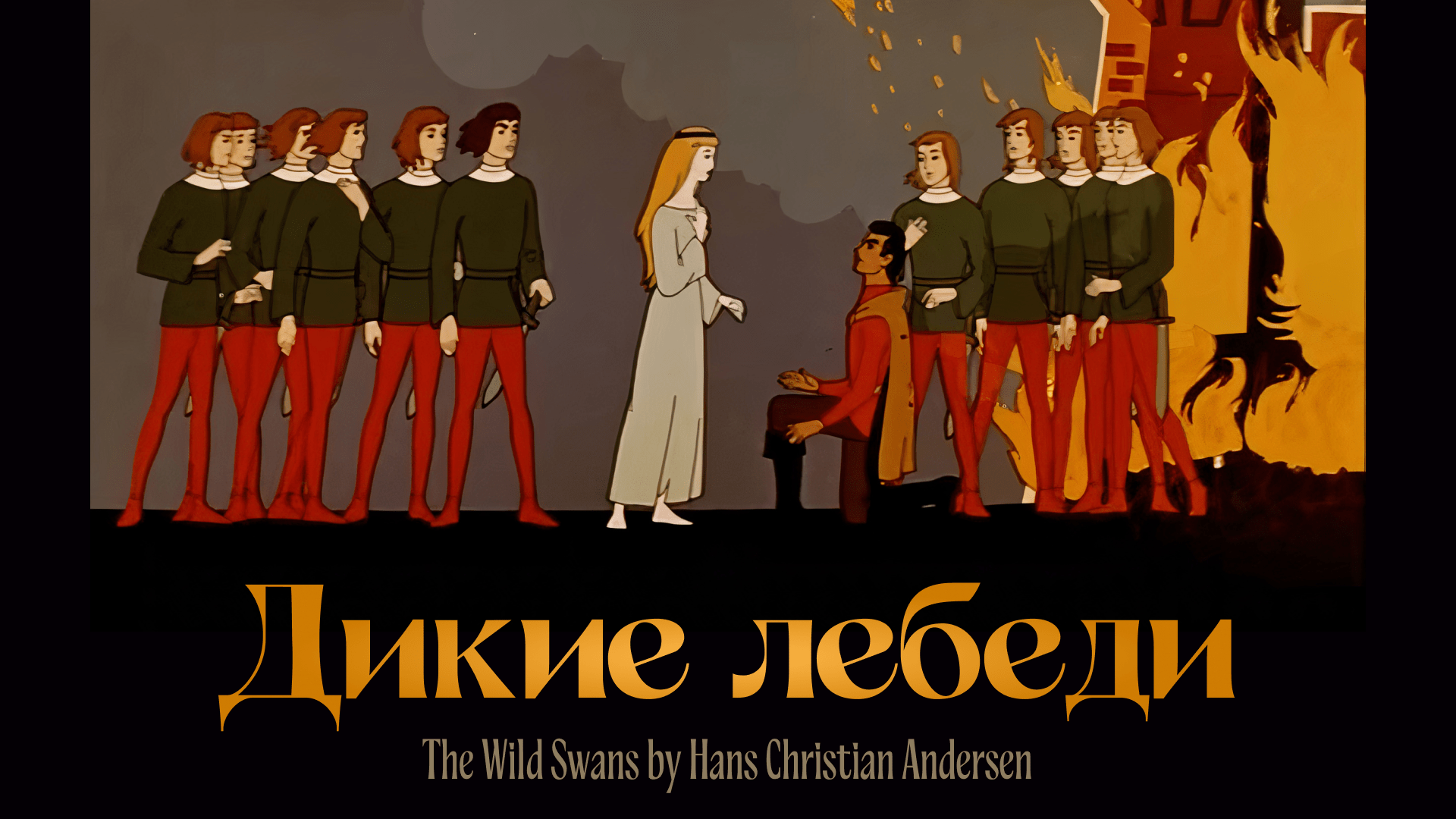
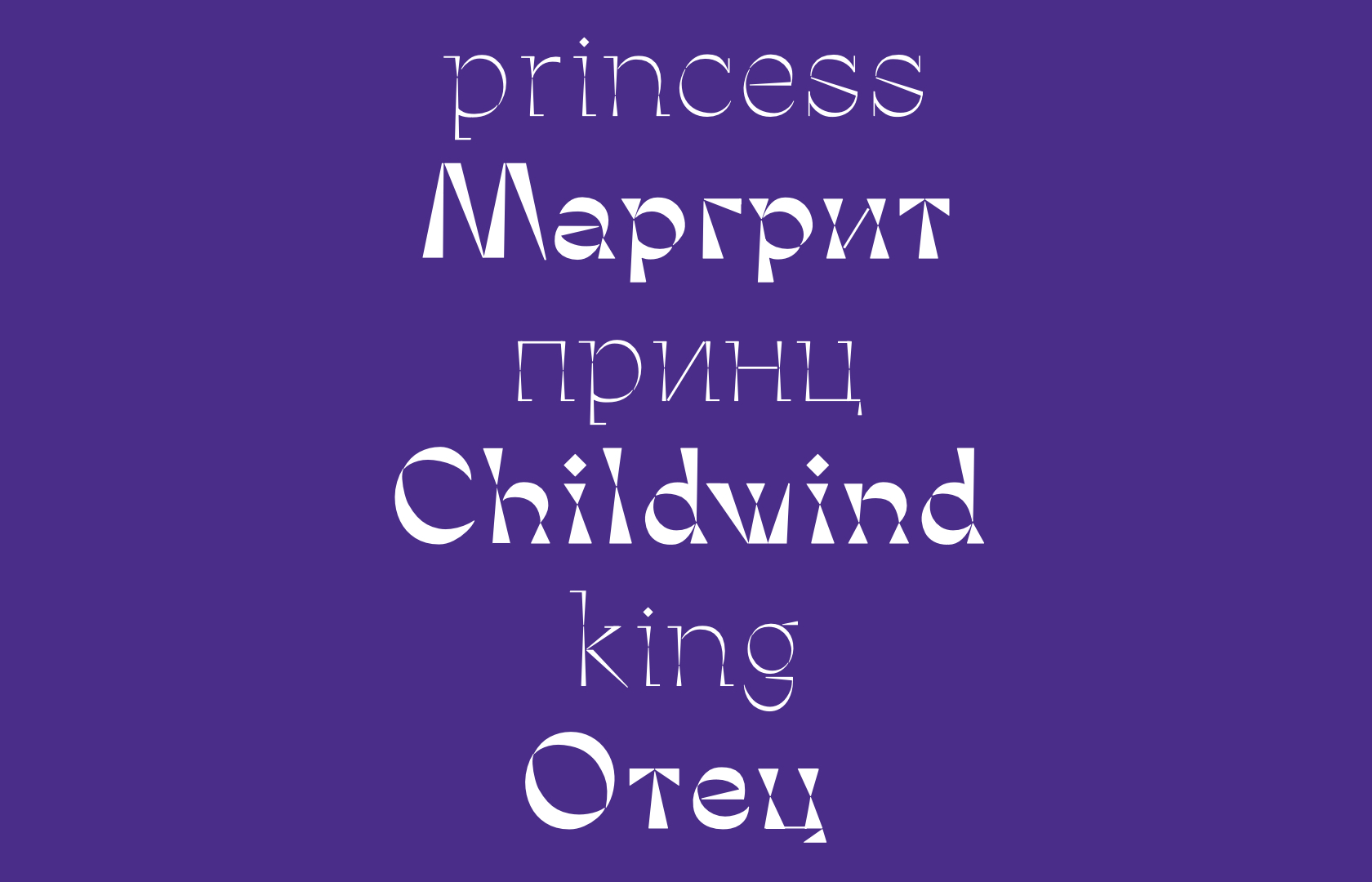
Elisa typeface is a reflection of the main character of The Wild Swans fairytale. Eliza was born a princess, tender and sweet, the only girl among eleven brothers. The base style is narrow and smooth. Rather than using sharp serifs, I carefully widened the strokes, using a balanced contrast.
The variability of the typeface in the context of the story is the long and hard path the main character had to go through. Eliza withstood all the difficulties and managed to keep her integrity and tenderness through all the turmoils. She also saved her beloved brothers, married a prince and became a queen. This is why the second style is more confident, solemn and contrastive.
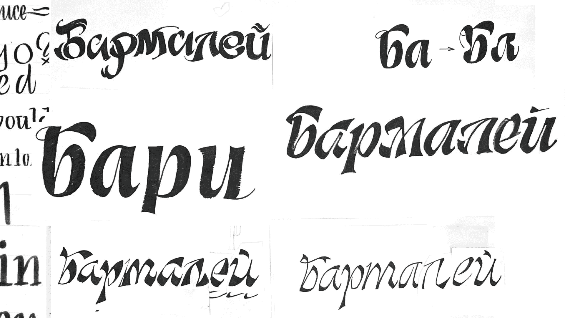
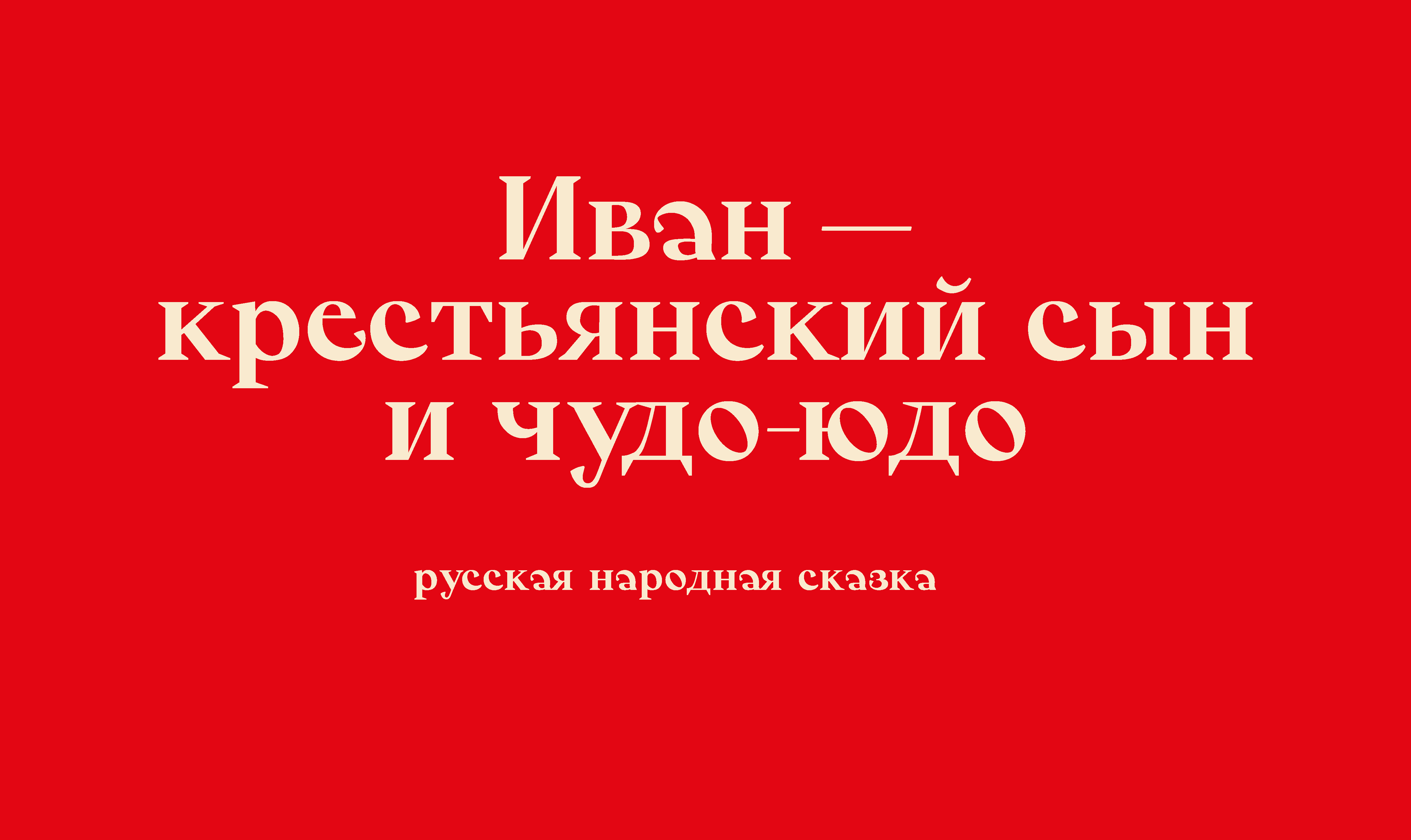
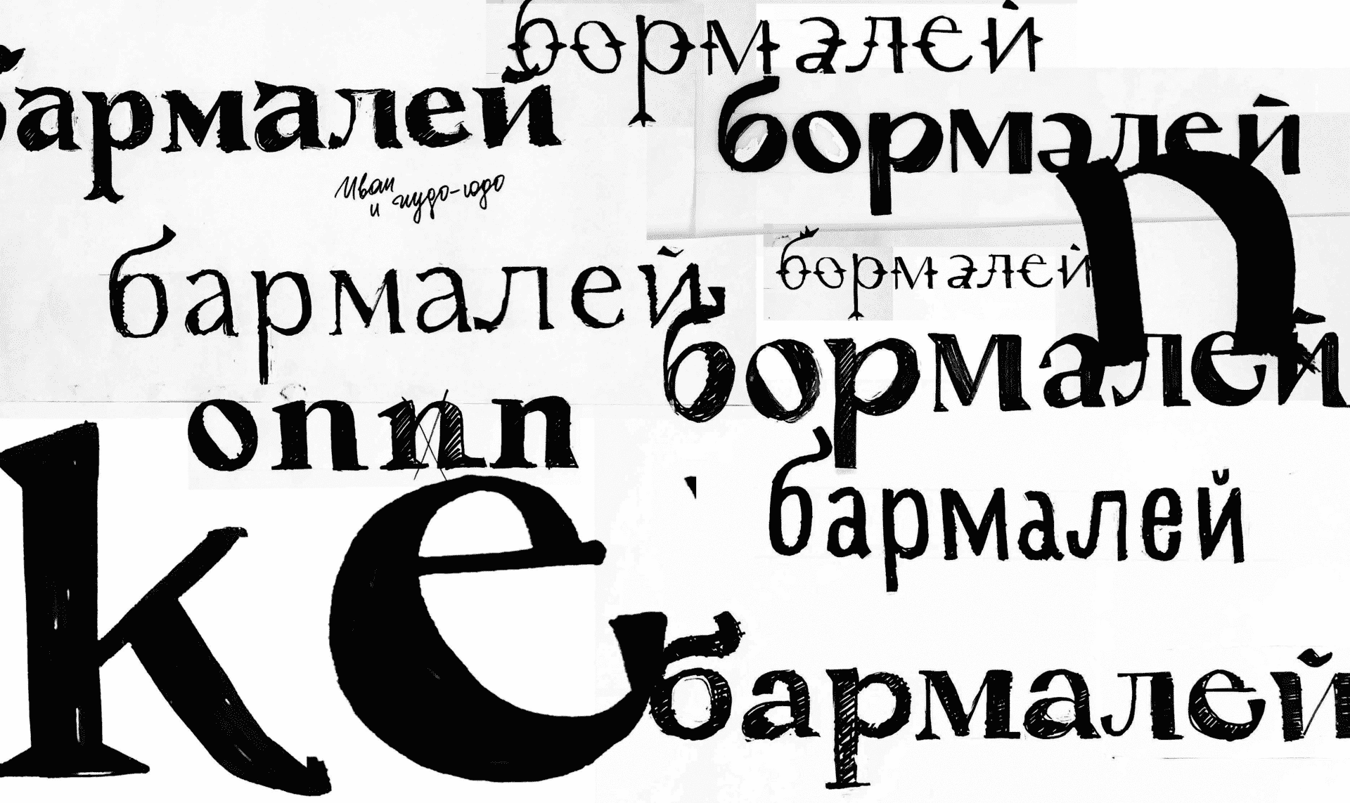
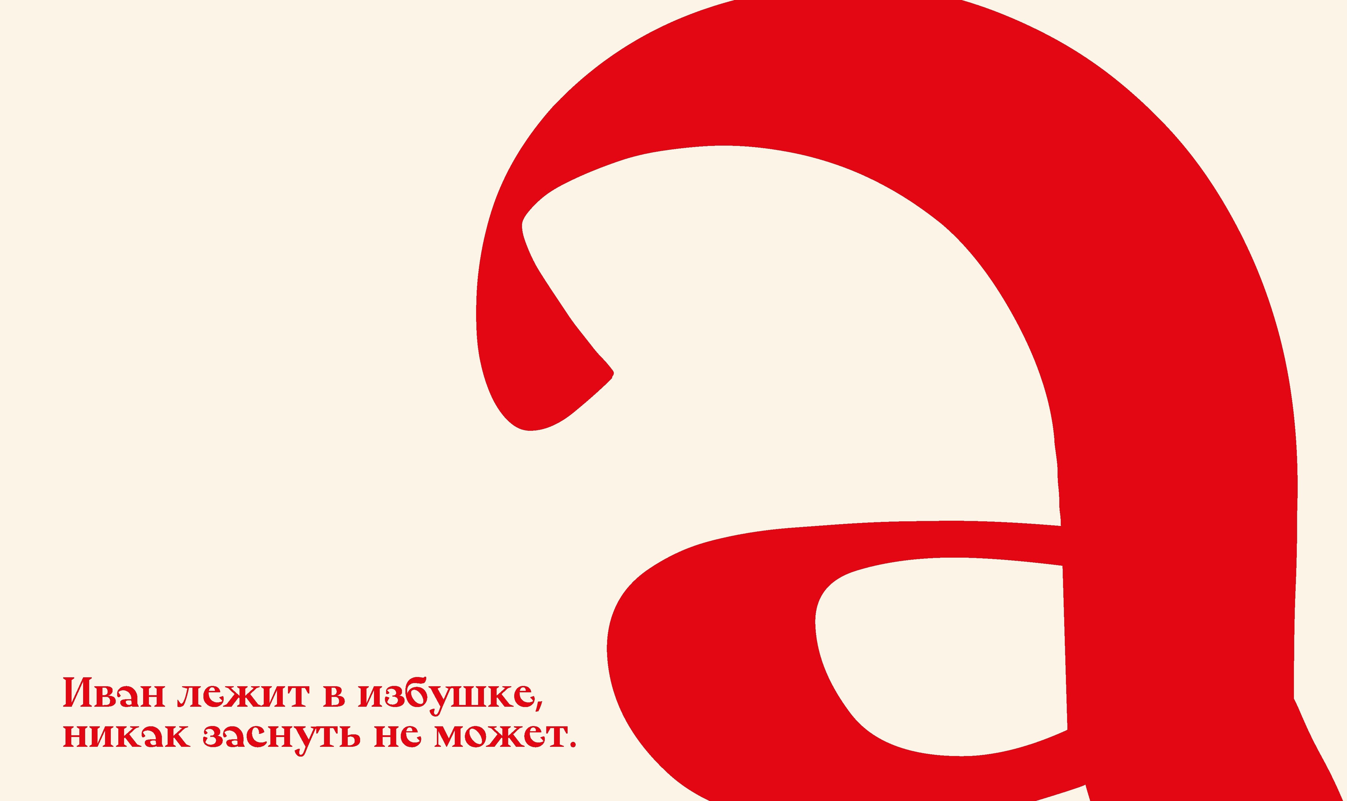
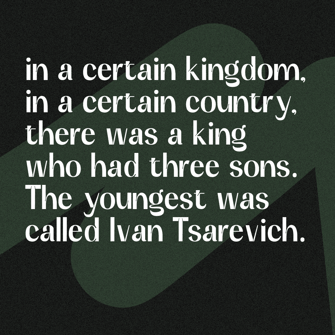
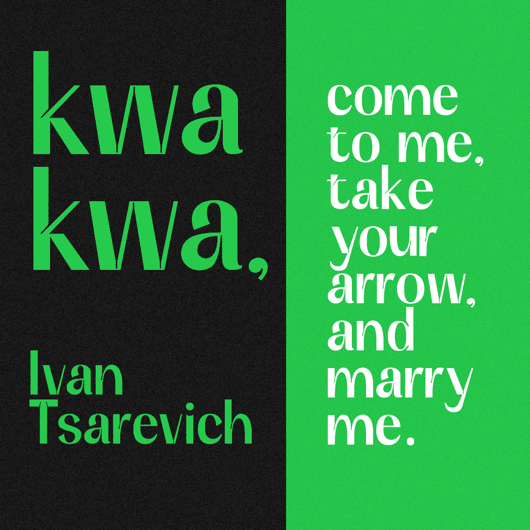
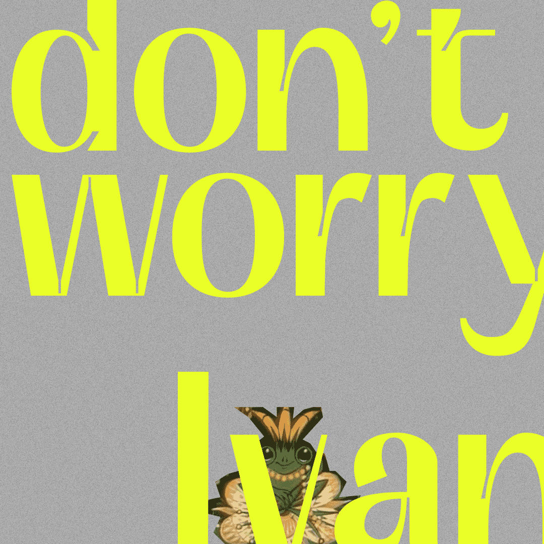
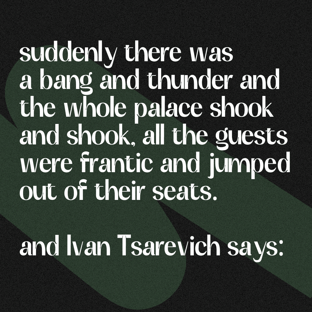
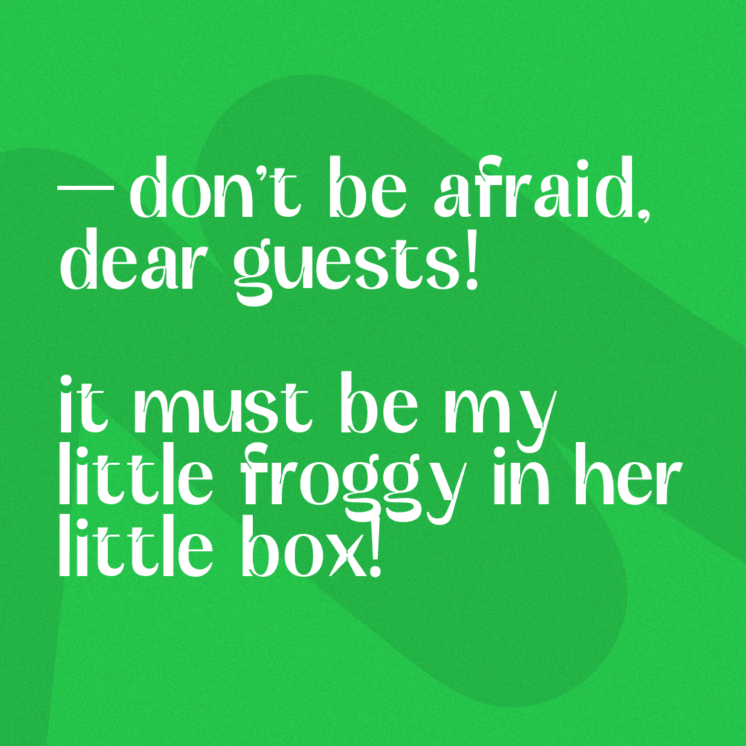
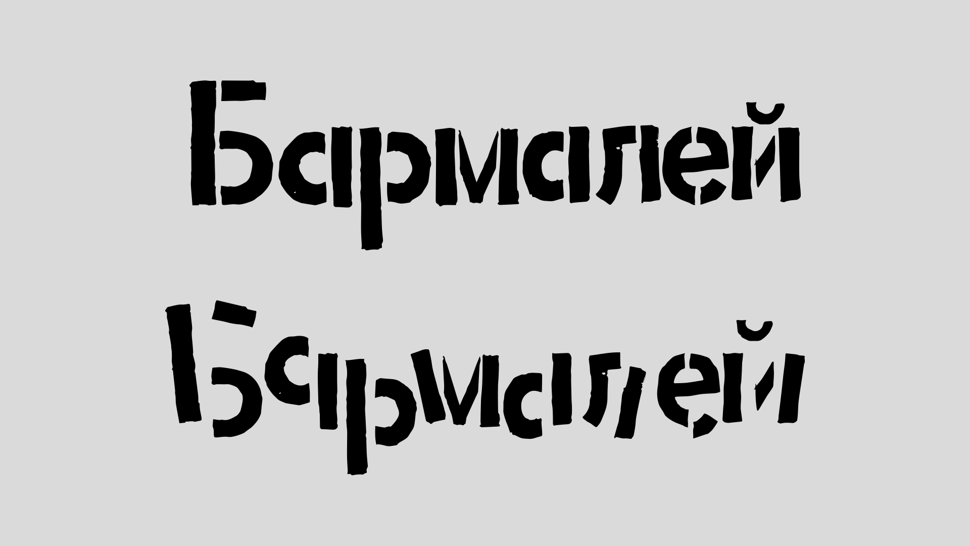
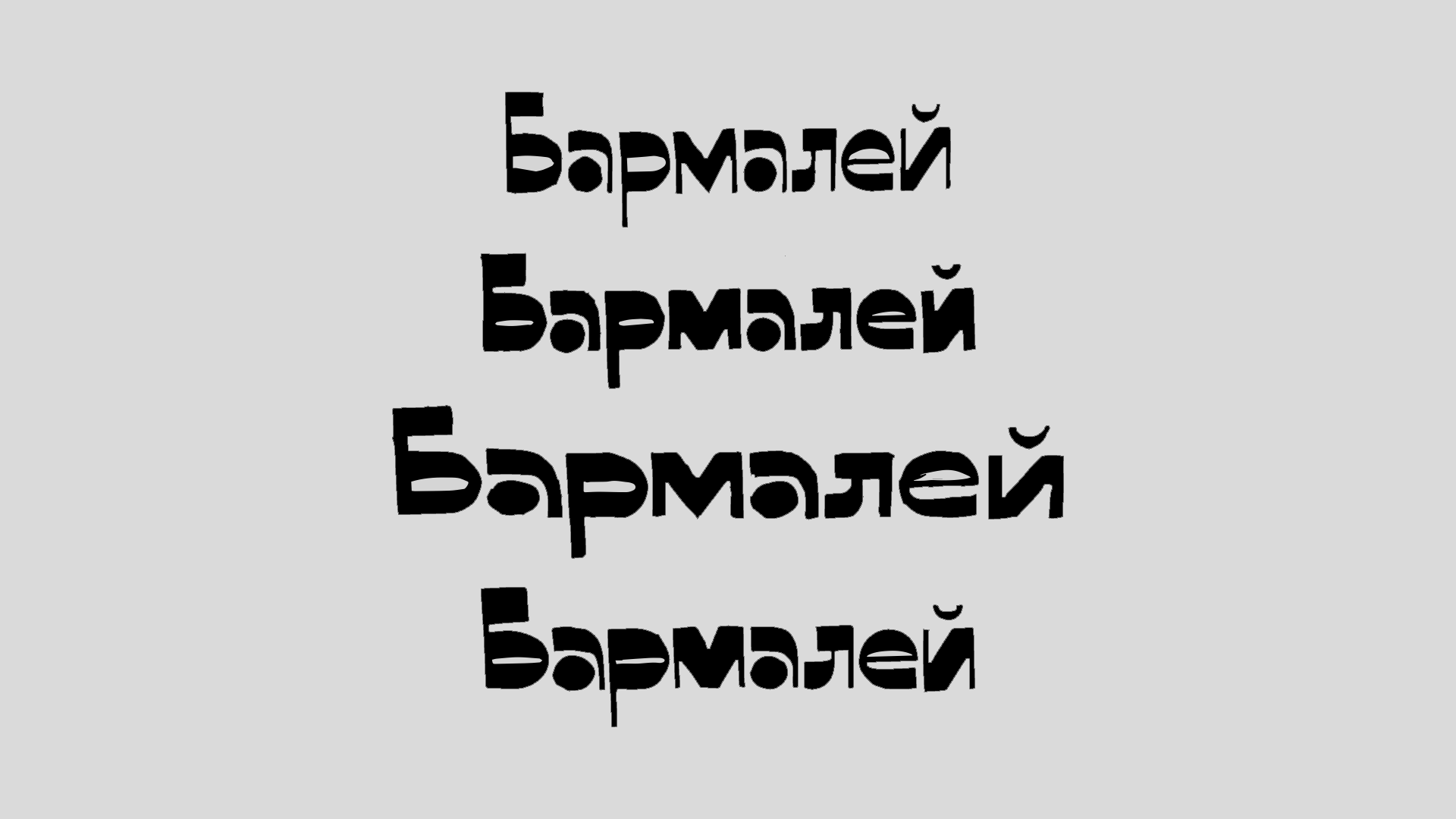
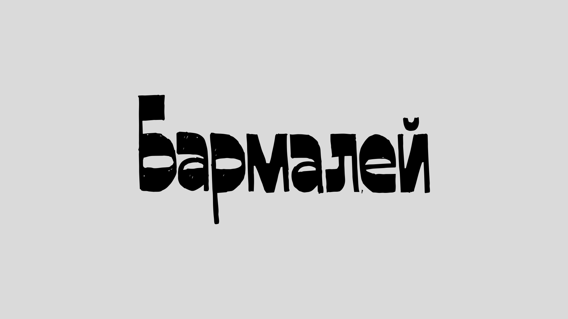
The project was inspired by the fairytale Ivan the Peasant’s Son and Chudo Yudo (rus. Иван-крестьянский сын и Чудо-юдо).

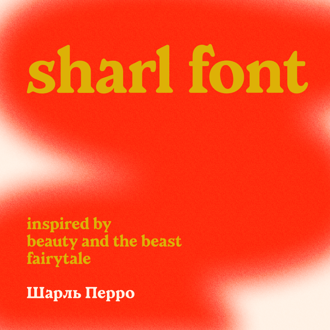
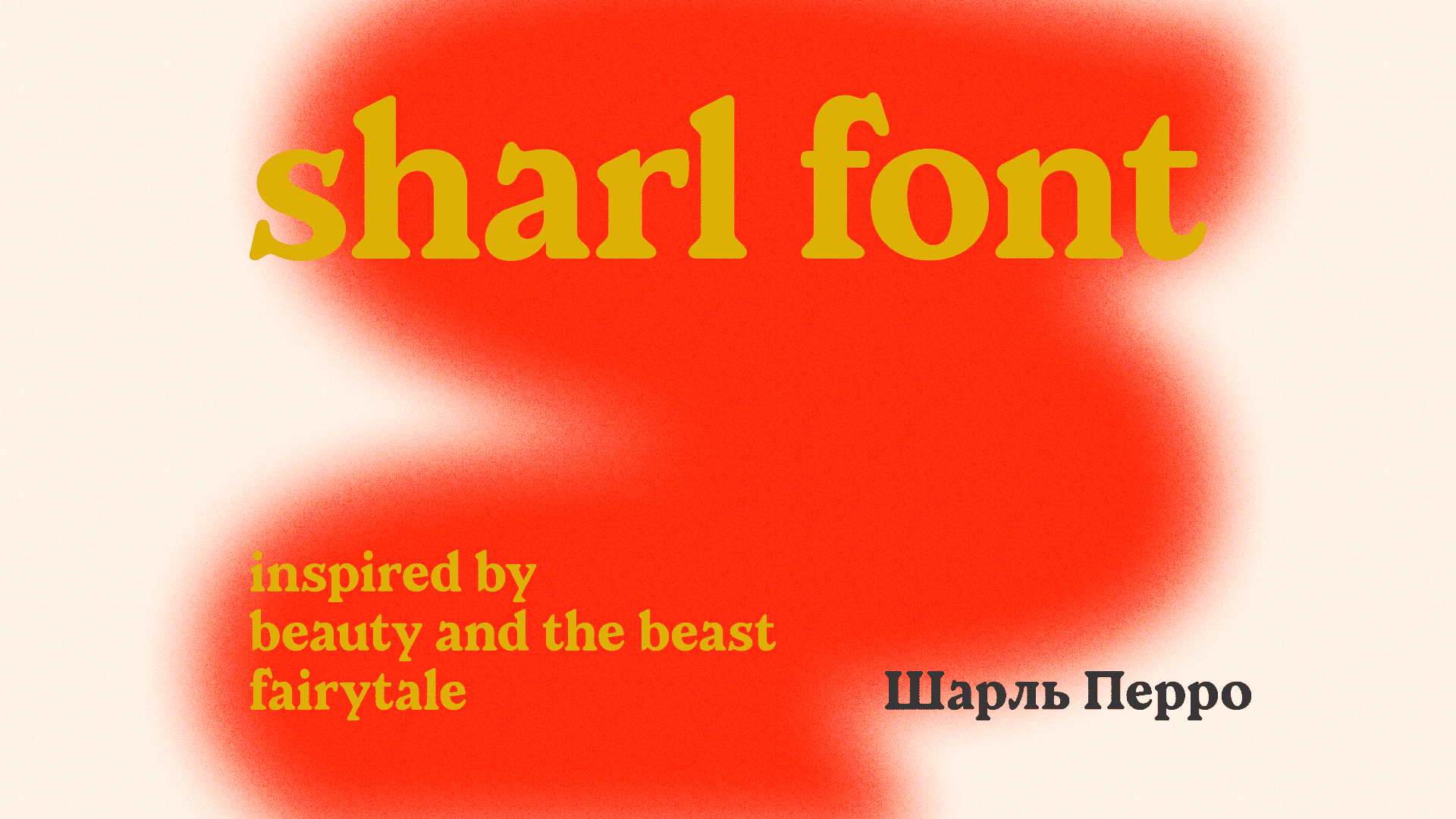
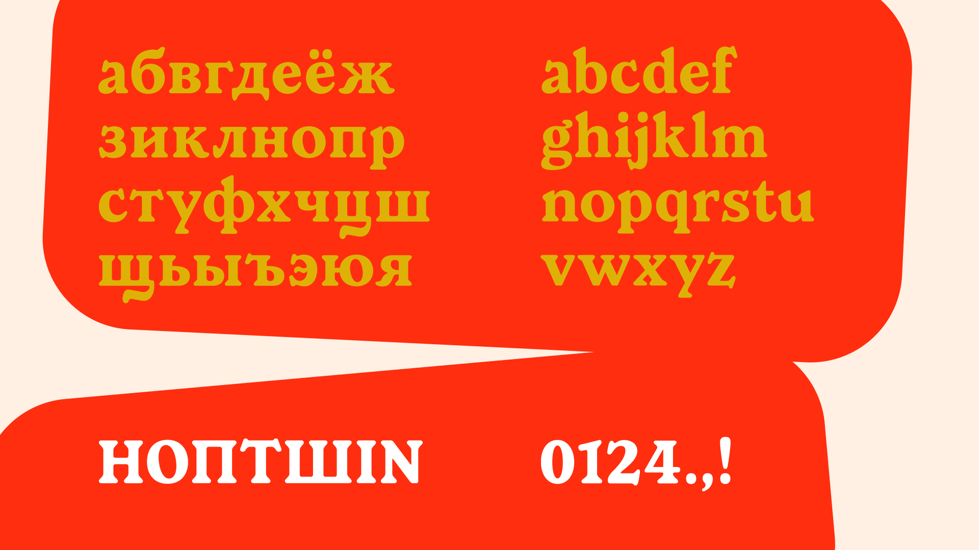
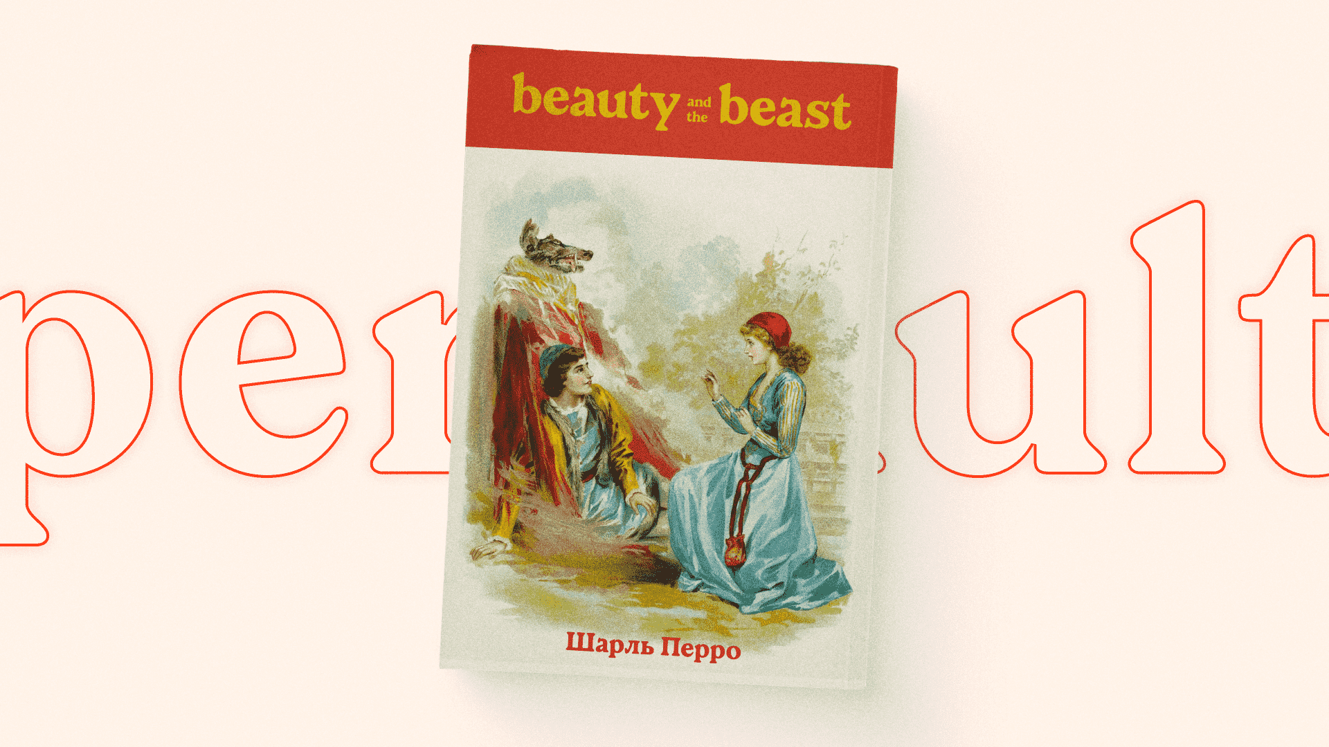
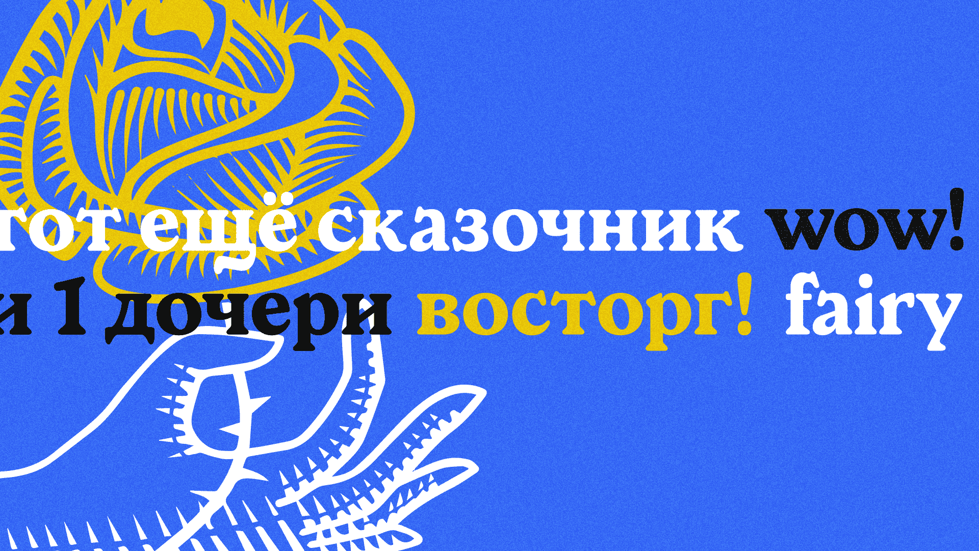
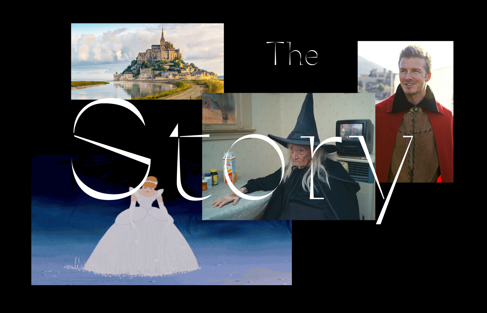
My project was inspired by the Beauty and the Beast—a fairytale by the French writer and storyteller Charles Perrault.
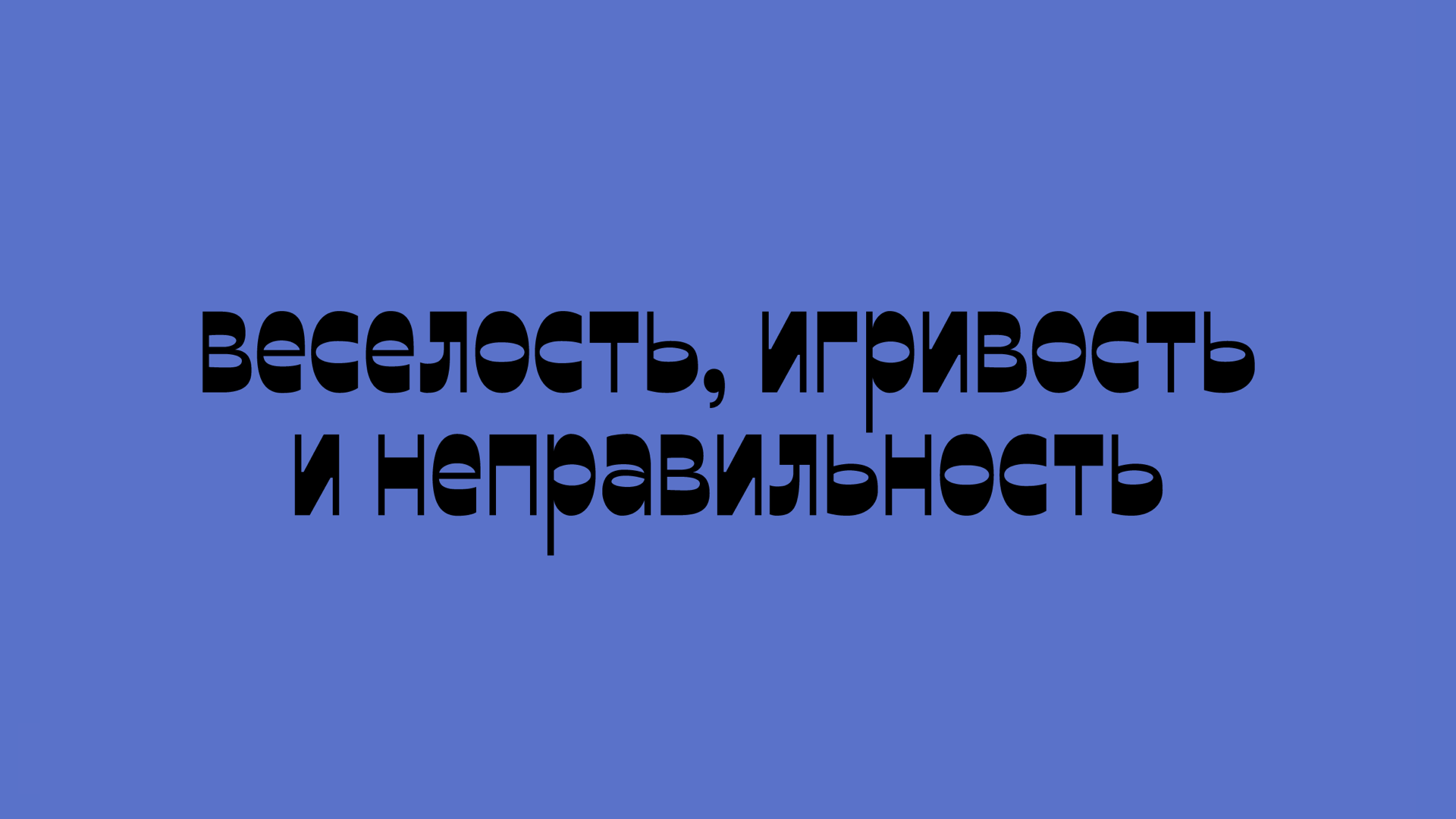
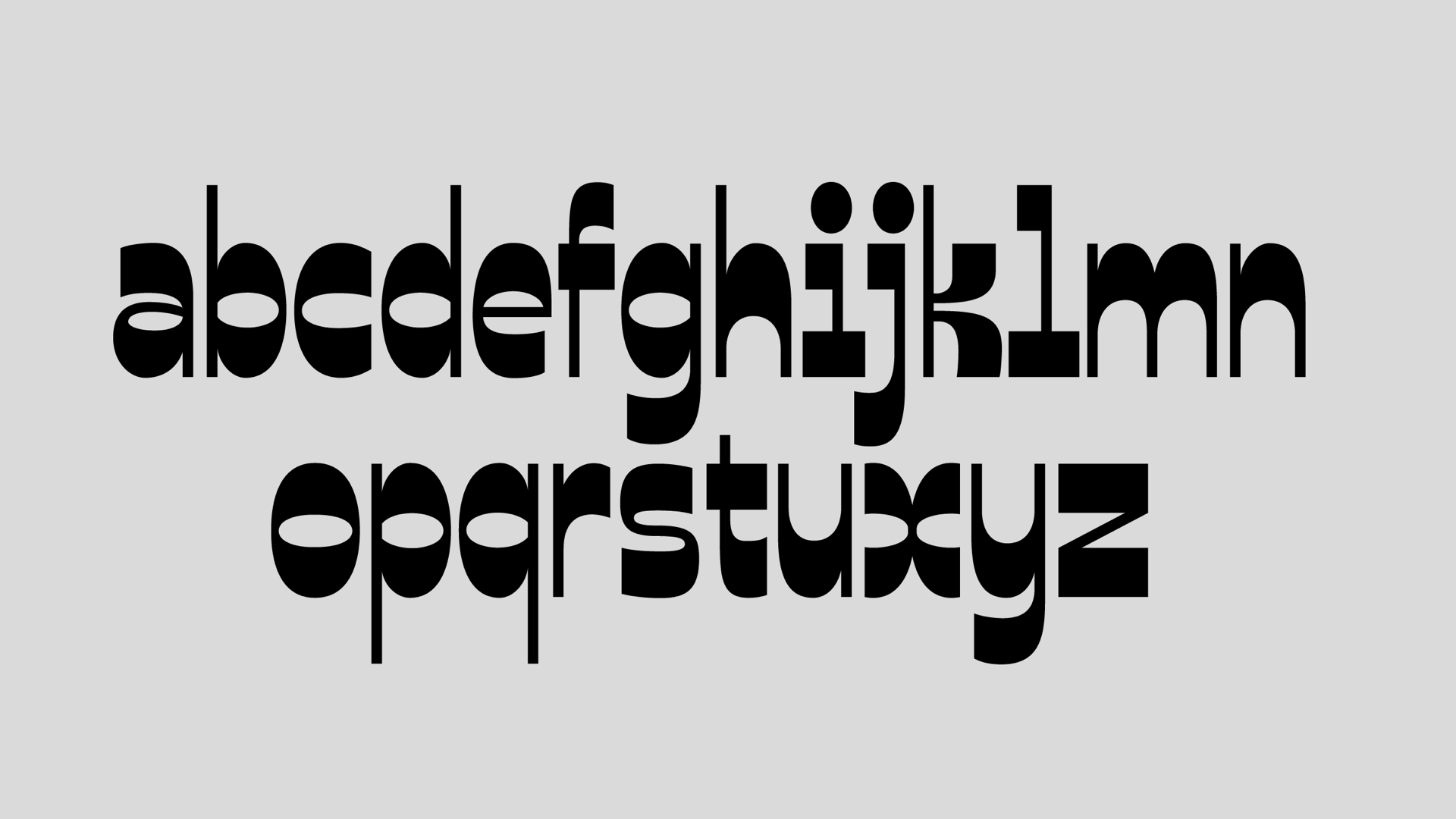
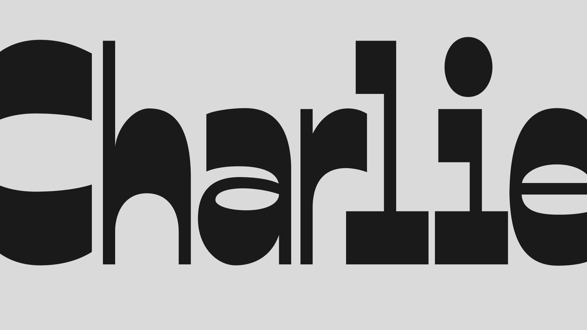
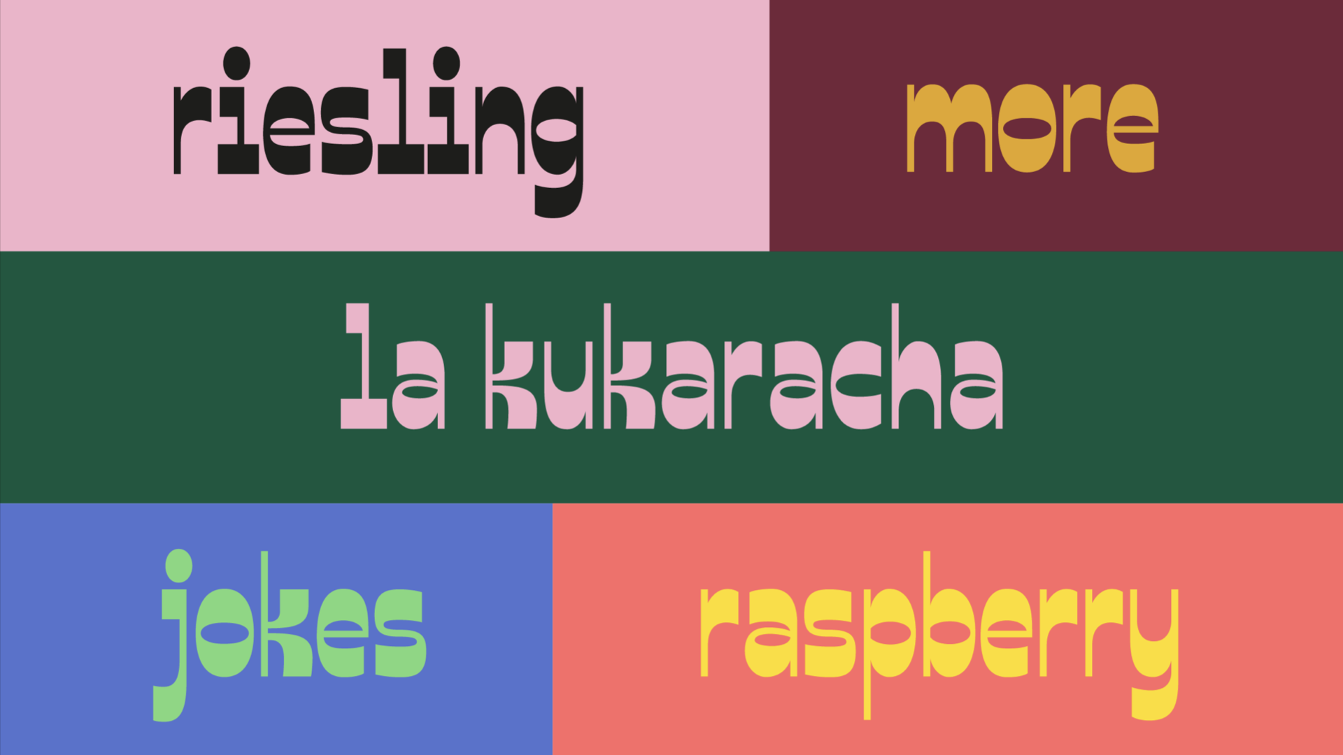
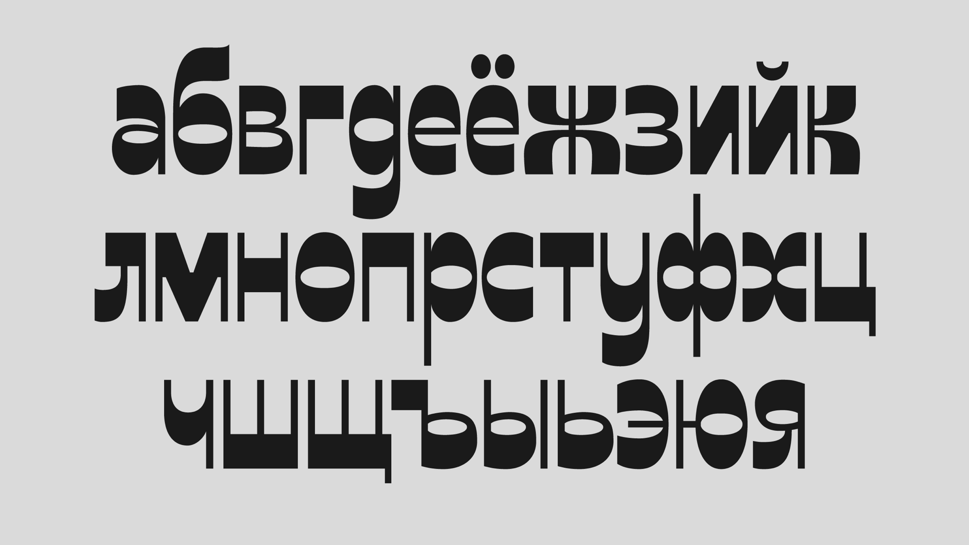
The main character is a kind, compassionate and hardworking girl. Her personality is shown through the softness and density of the type. According to the story, Beauty is very active and always willing to help. This is why I added slight dynamism to the font through the tilted round letters. As a final result, I managed to design Cyrillic and Latin lowercase characters, alongside with a few cursive letters, numbers, and punctuation marks. At the moment the typeface can be used in large titles and short texts.
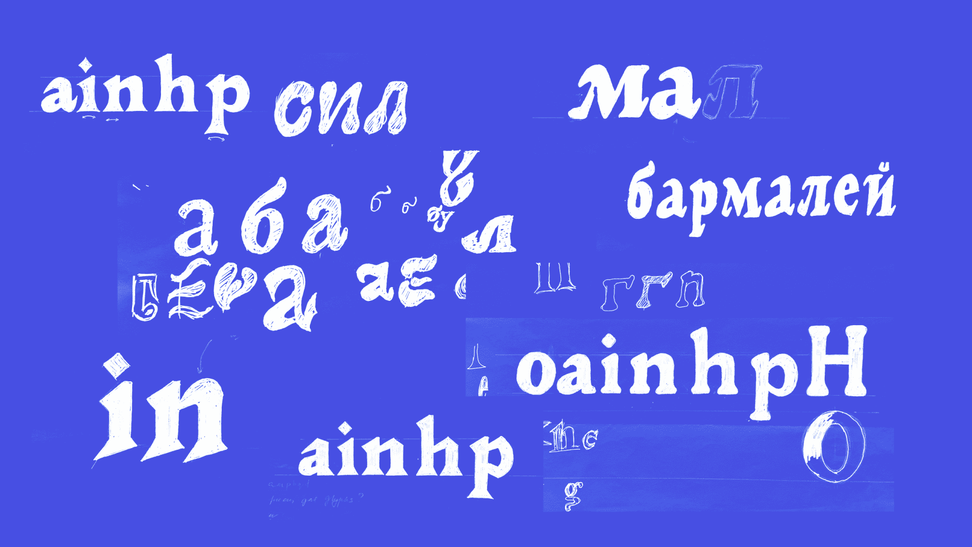
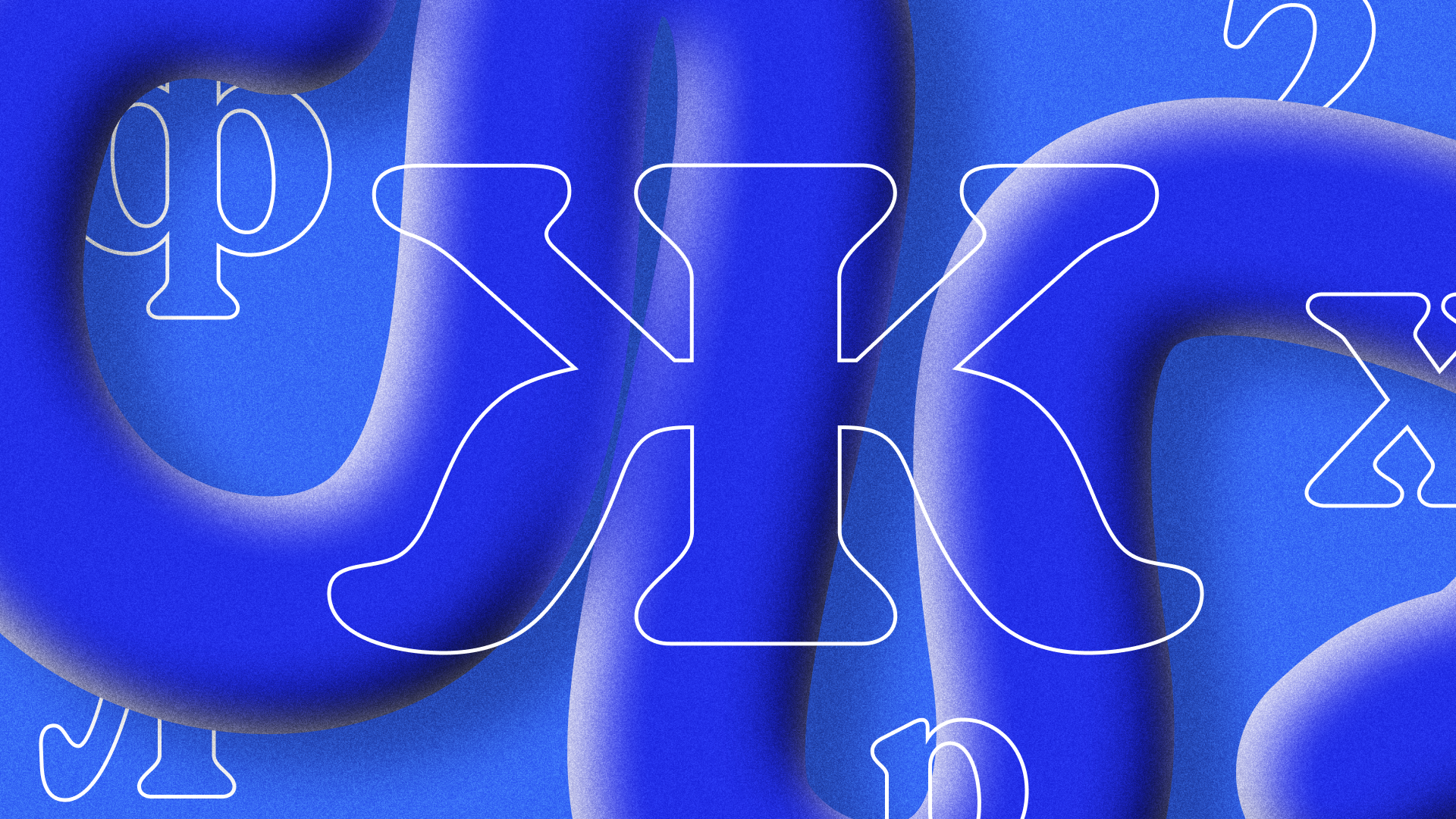
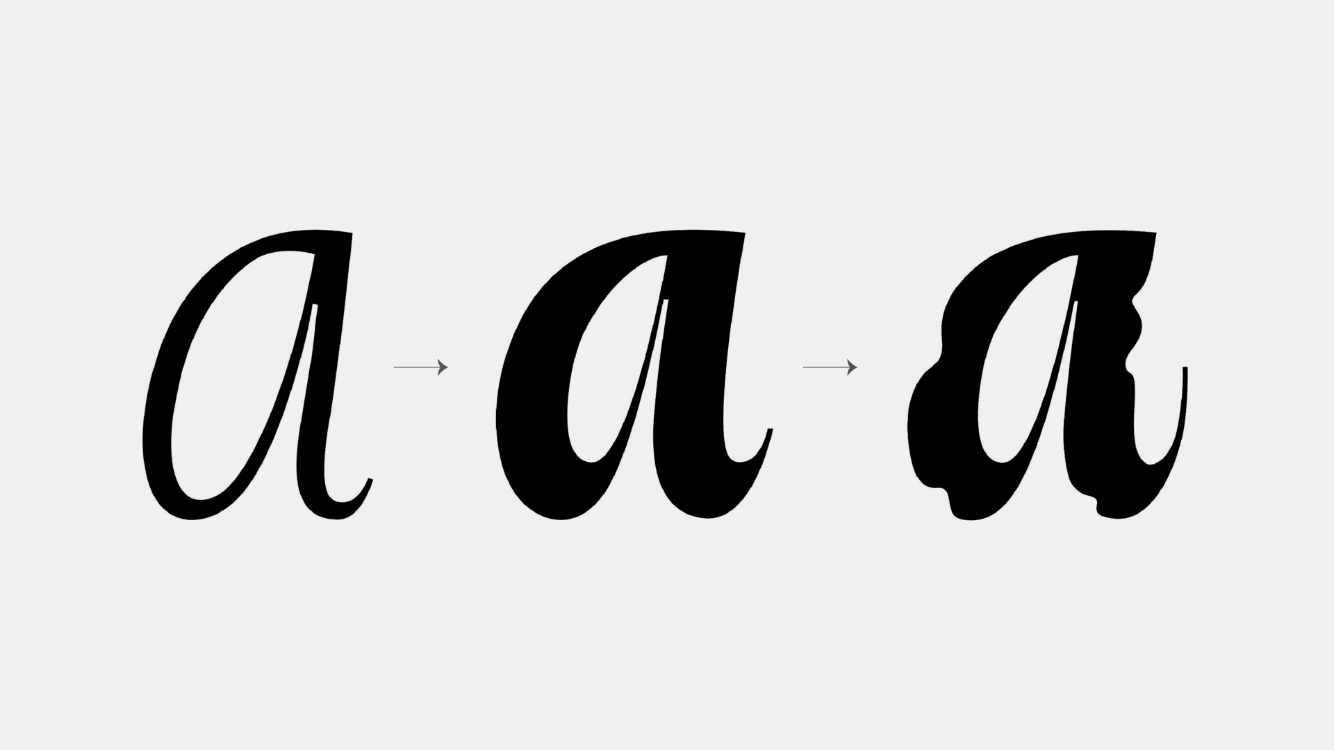
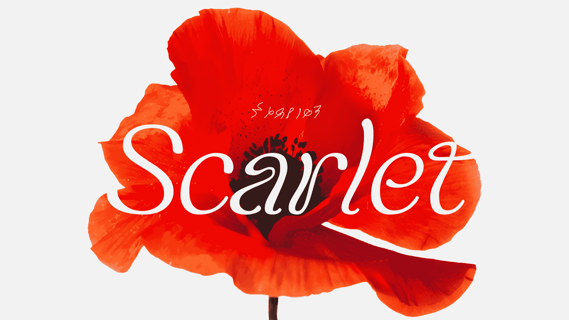
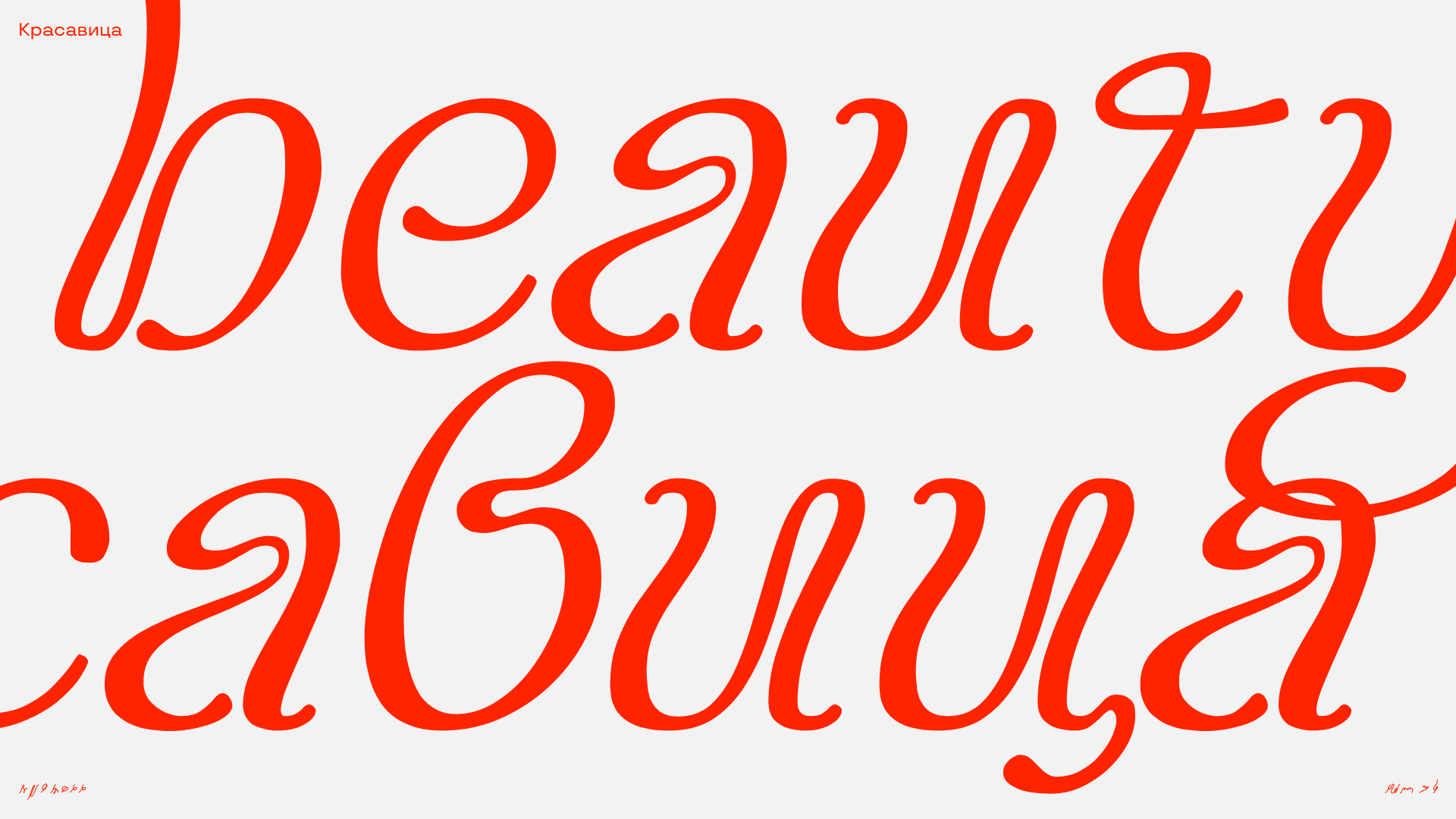
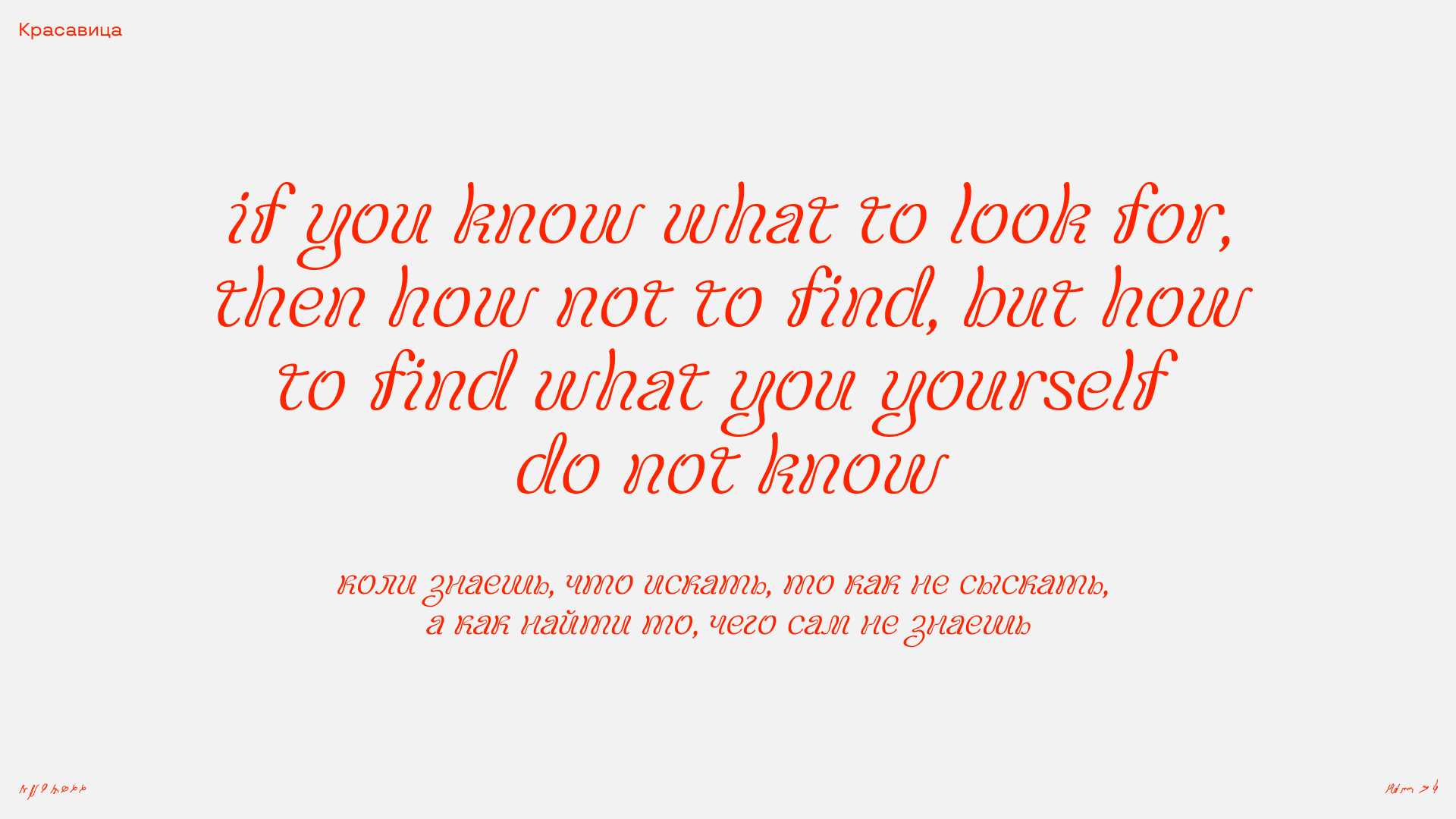
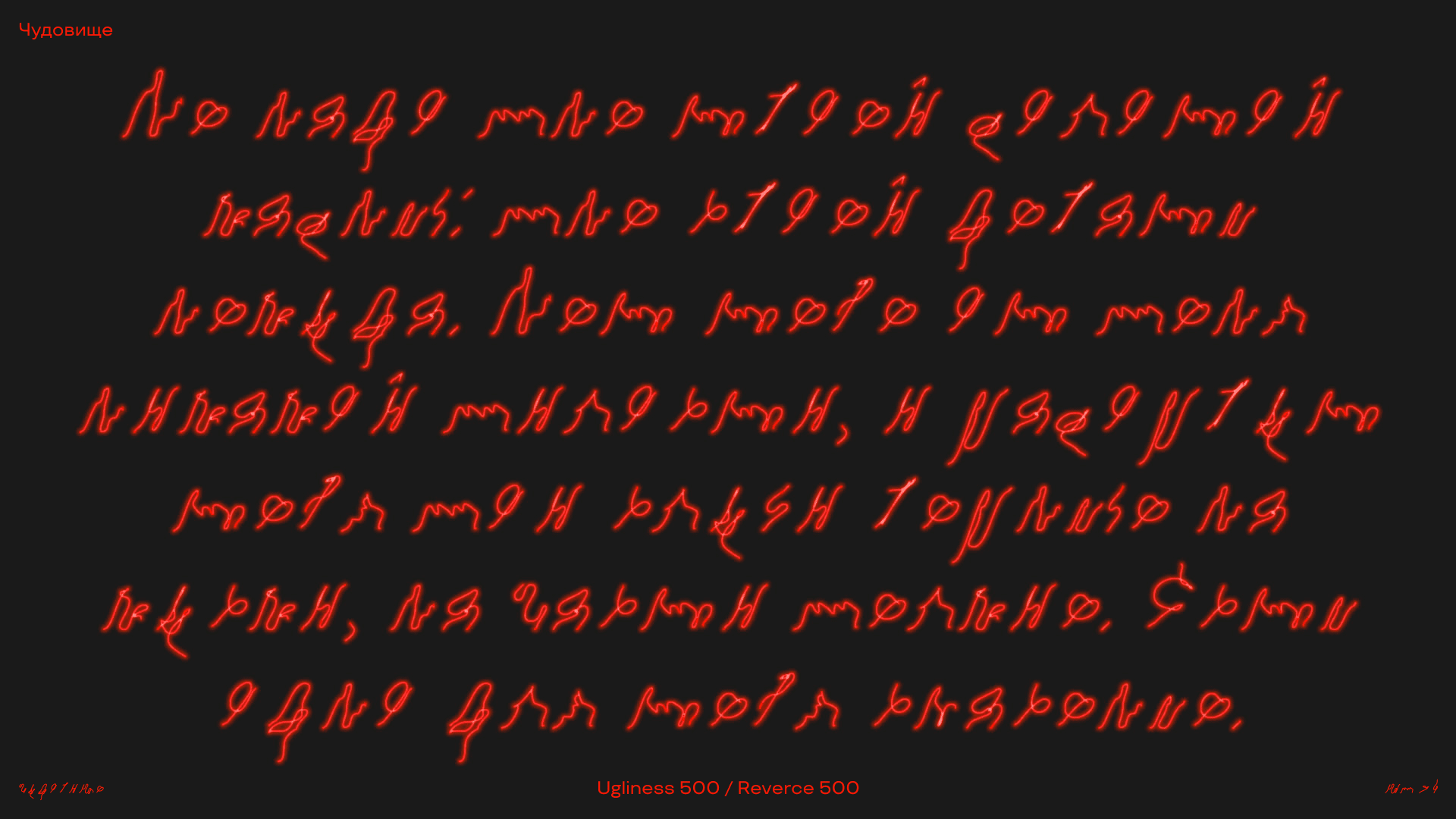
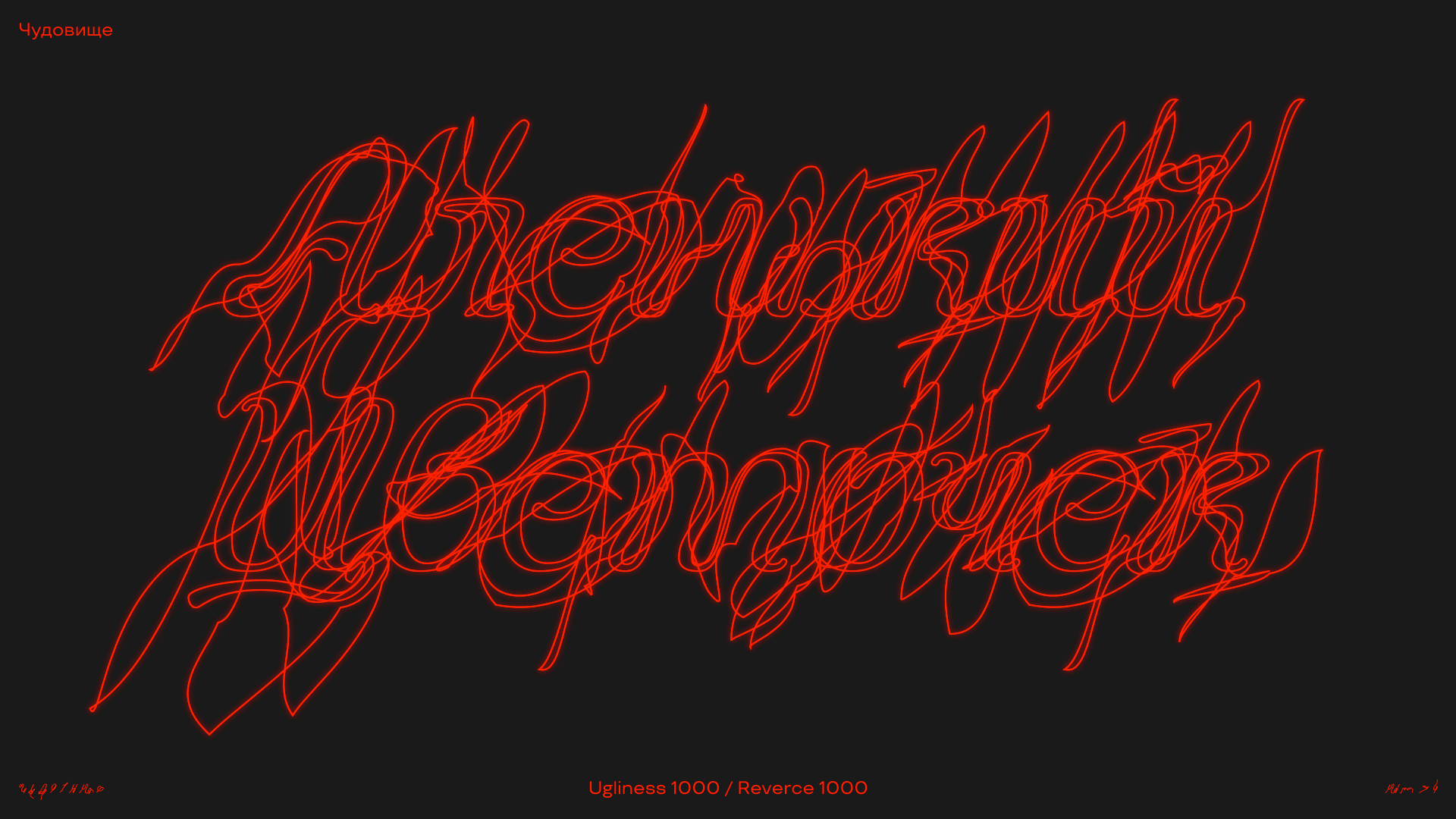
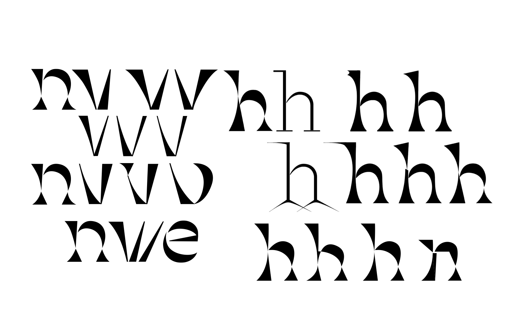
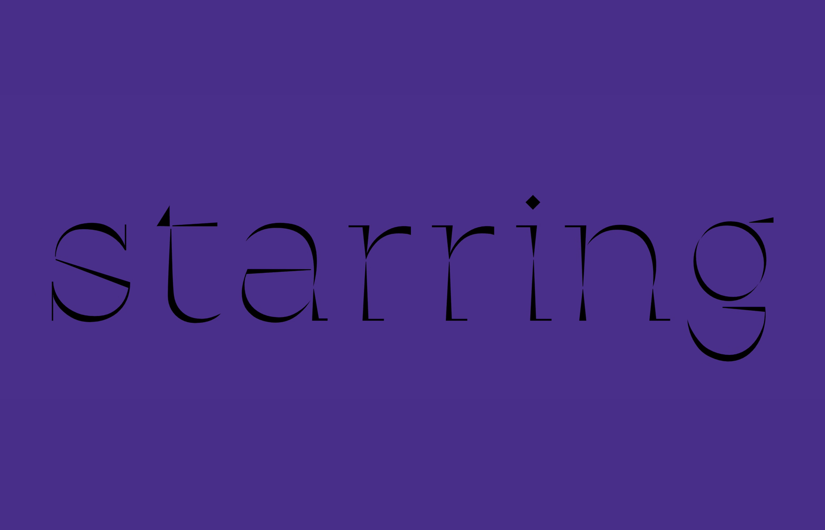
Scarlet Flower is a fairytale where plants play a significant role, so I wanted to use curves and unconventional letterforms to show the organic elements. This is why “Beauty” in Scarlet does not have any sharp angles, and each letter is spelled without lifting the “pen”. The Beast in the tale is so fearsome that no one can bear to look at him or listen to his voice. This is why the Beast’s letterforms are completely illegible. This effect was achieved by using interpolation with 2 axis. “Beauty” and the “Beast” can be used independently as well as together.

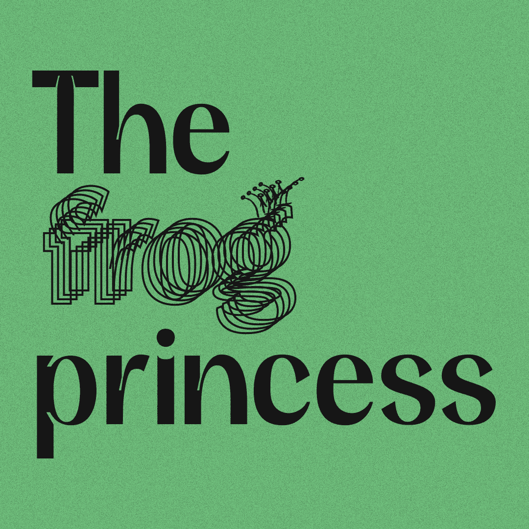
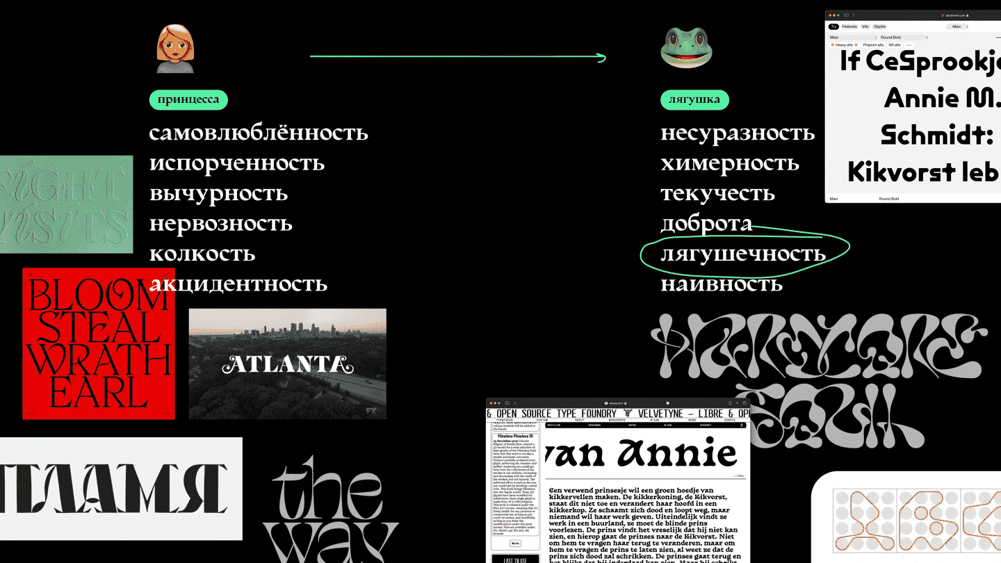
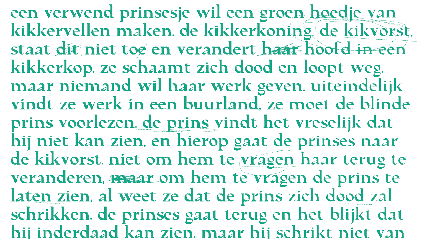
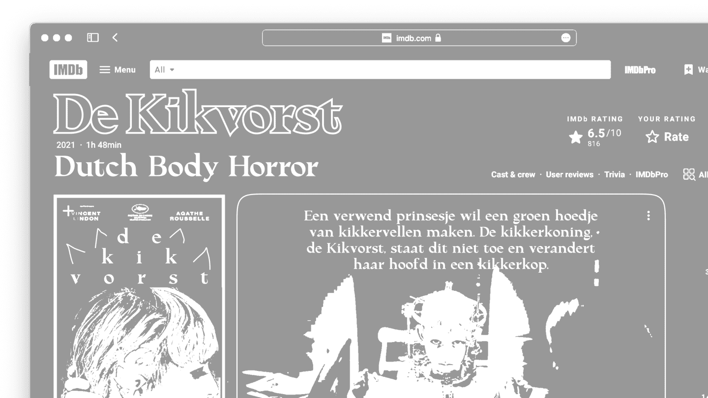
The project was inspired by the fairytale The Frog Princess.

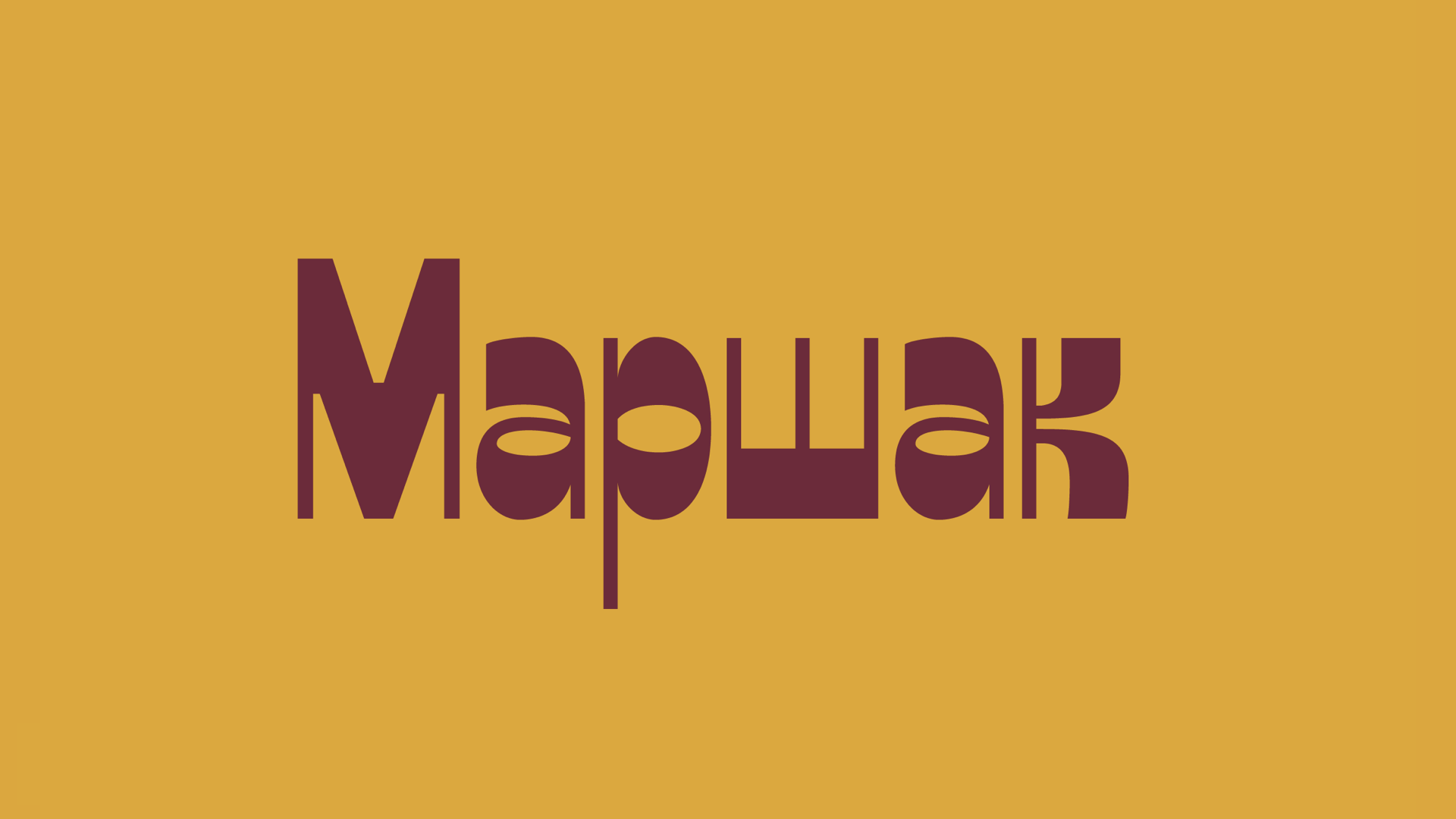
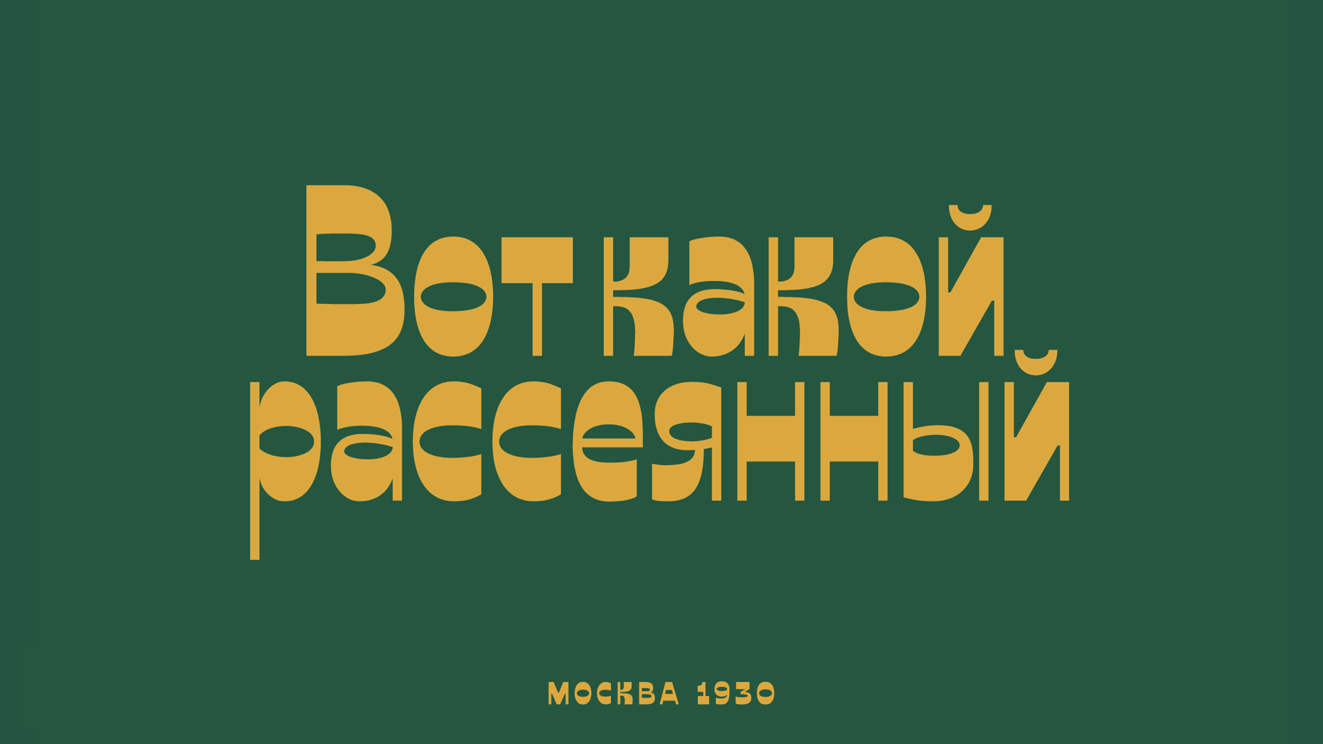
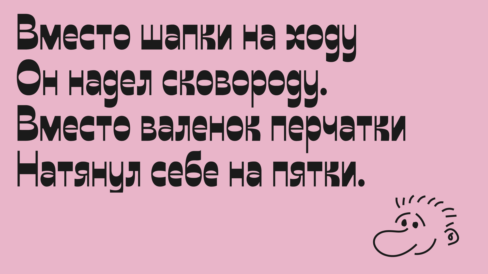
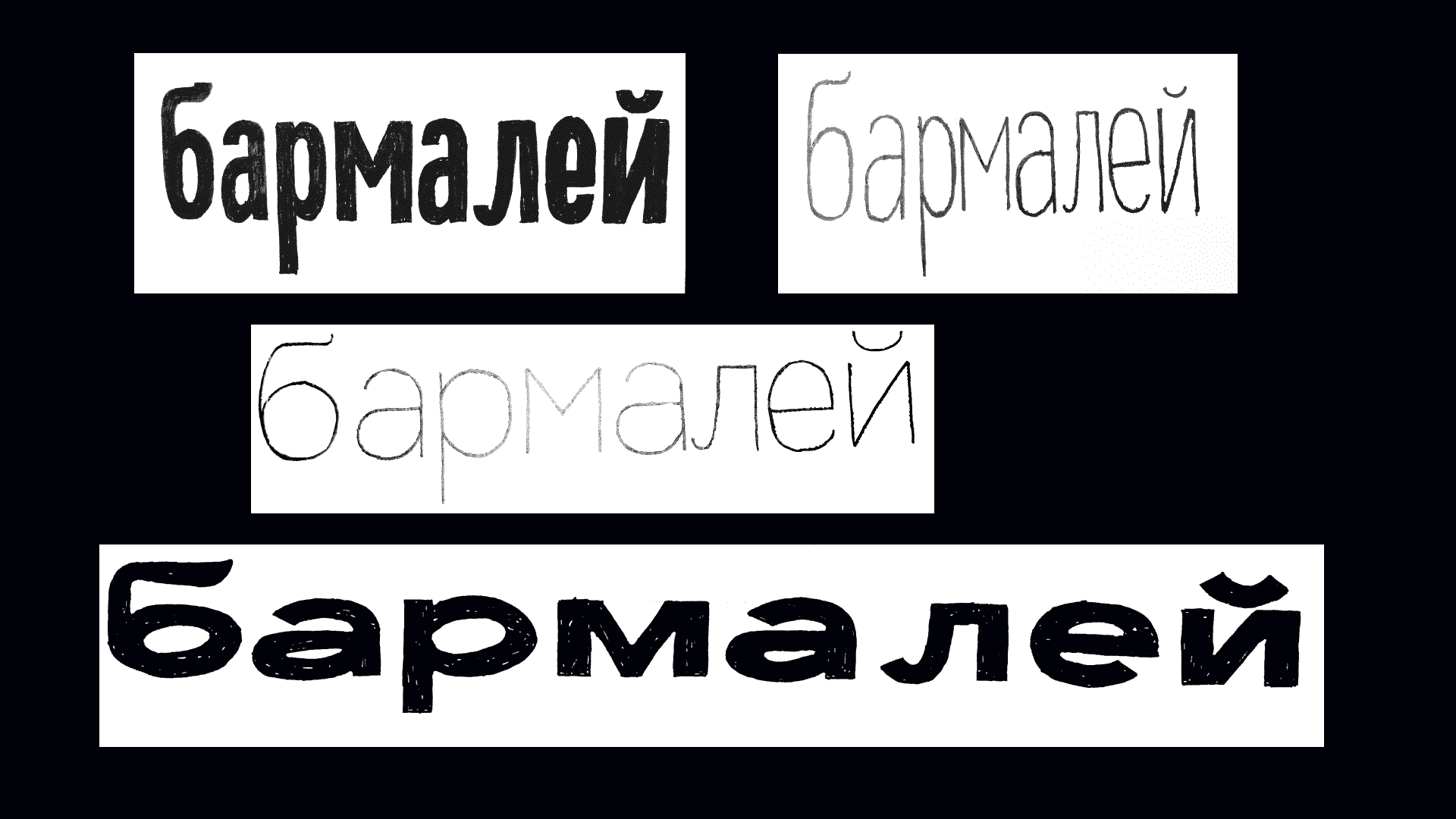
The project was based on the tale “What an absent-minded man” (Rus. Вот какой рассеянный) by Samuil Marshak.
This typeface grew from fairy tales, just like us.
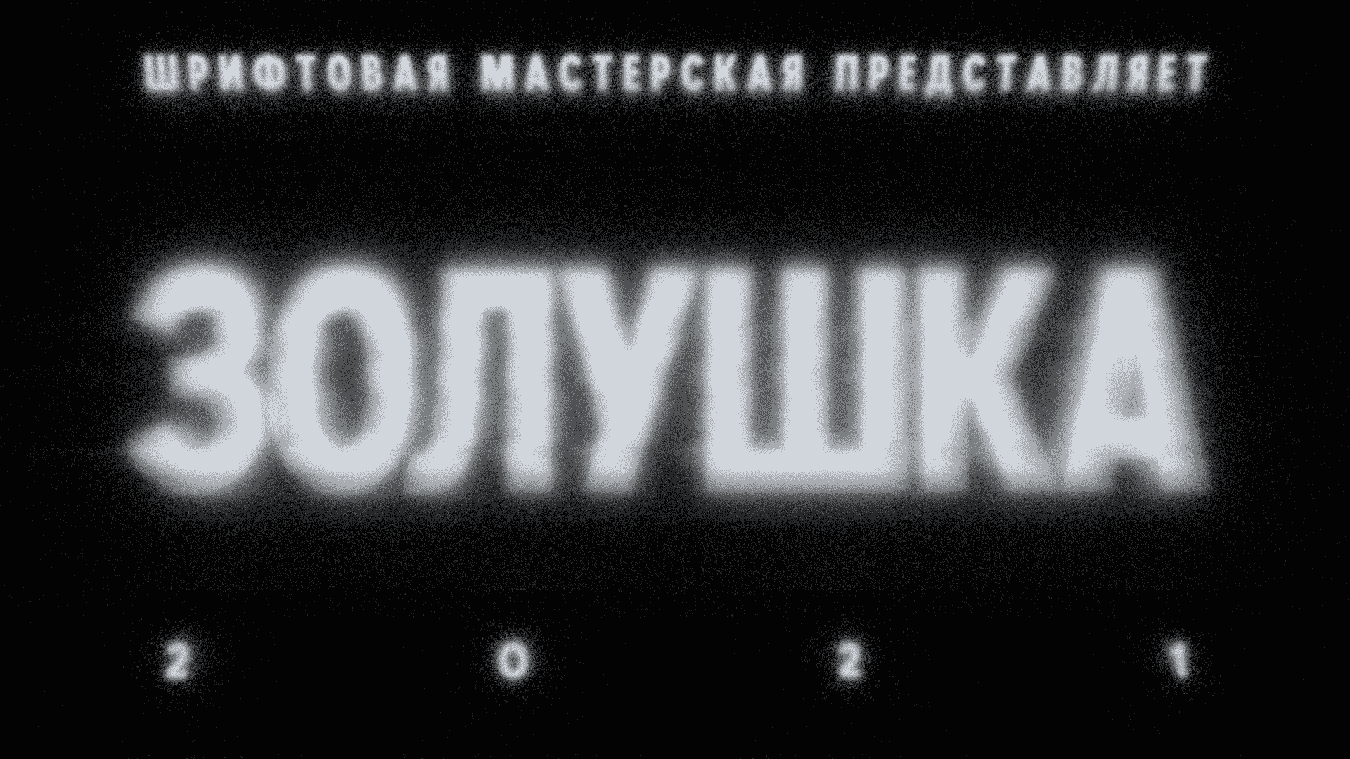
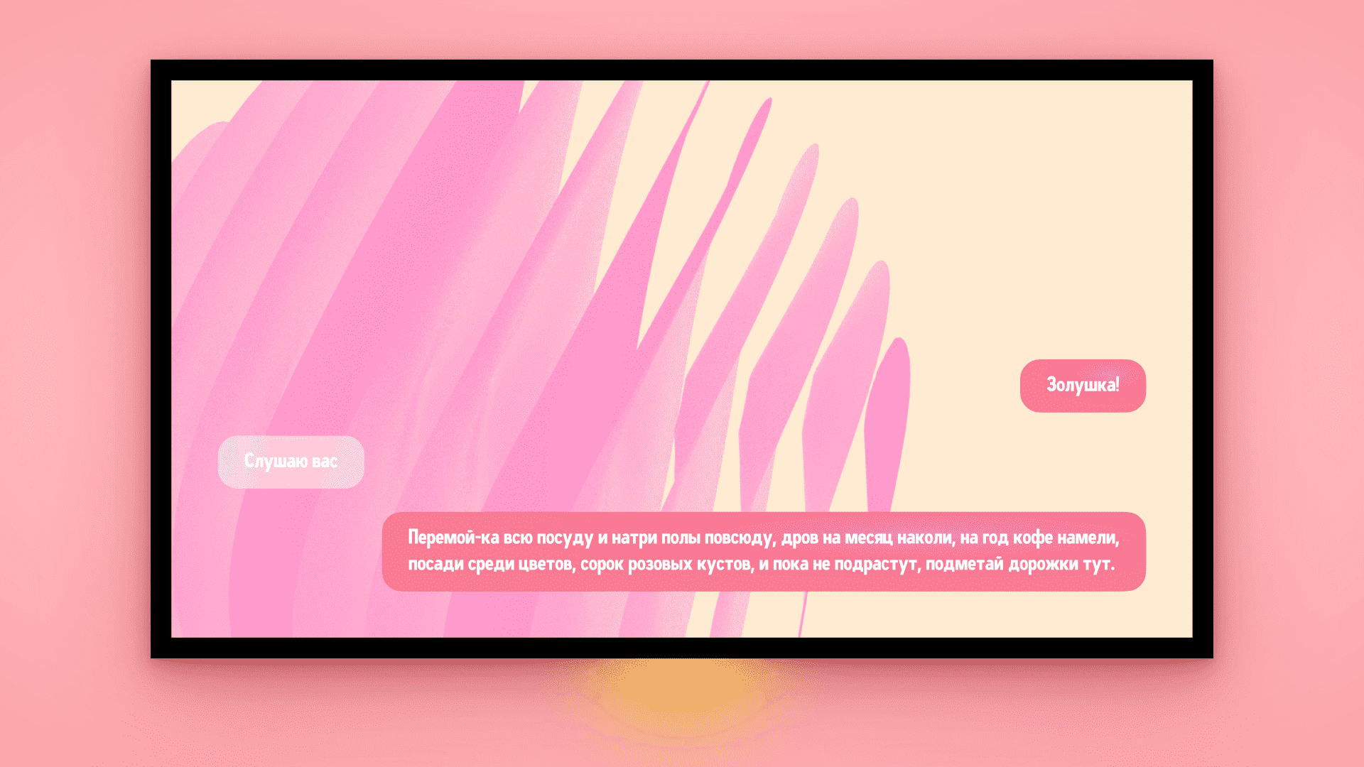
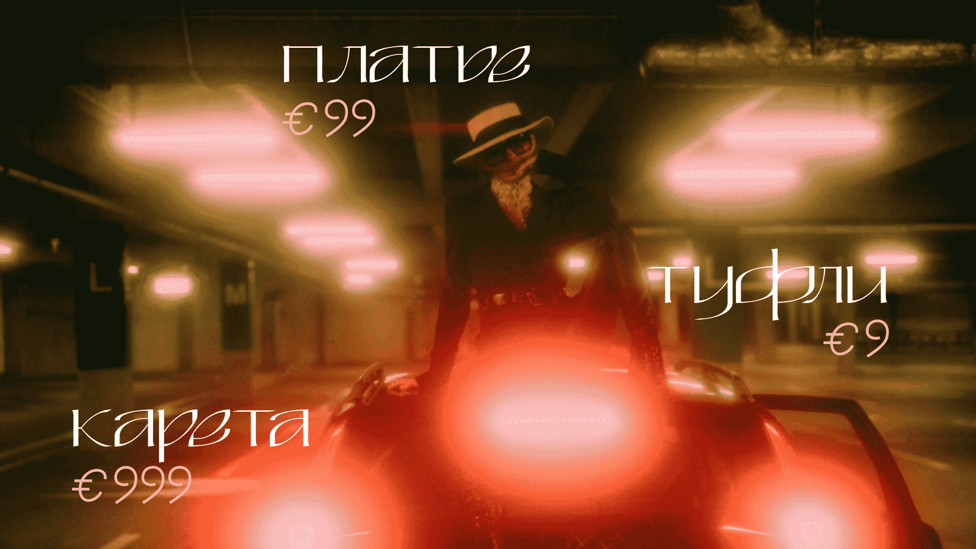
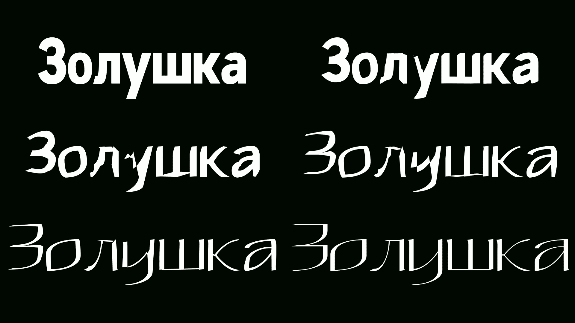
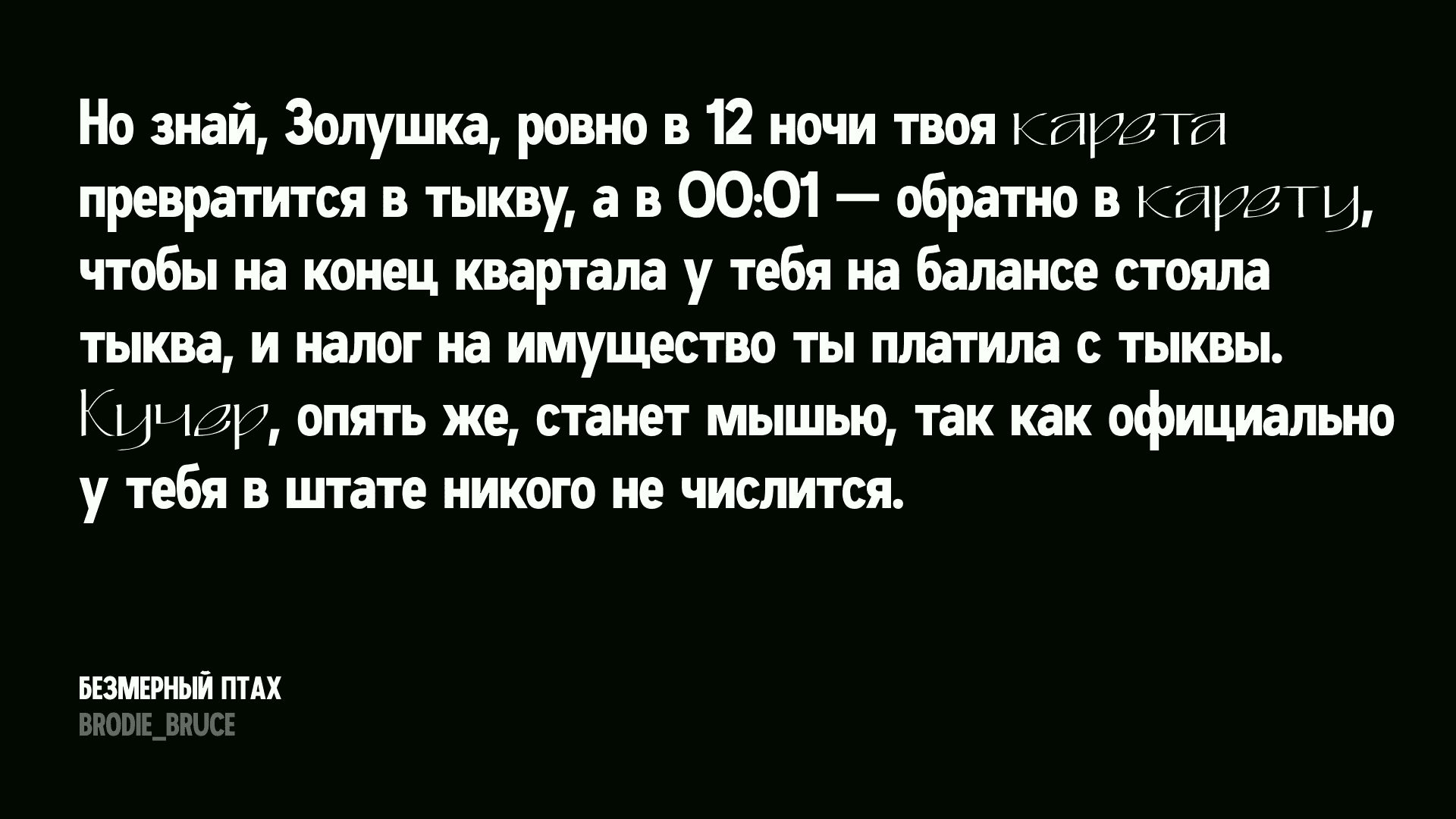
Just like we, as kids, felt bad for the misfortunes of the poor orphan, who unquestioningly settled for the unbearable tasks, we cannot stay indifferent looking at the typeface today. Humble, timid, afraid to stand out, yet soft, loving and open—are all ways to describe Cinderella.
She is not paired with a Prince, oh no, her counterpart is the Fairy Godmother, whose magic wand is known to perform miracles. So with a light wave of the wand, Cinderella is transformed into something unseen yet magnificent.

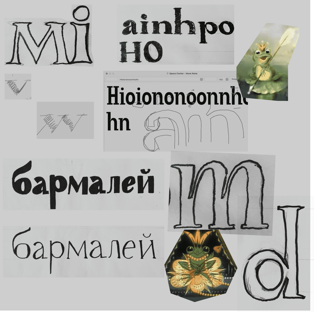
The project was based on the Frog King fairy tale.


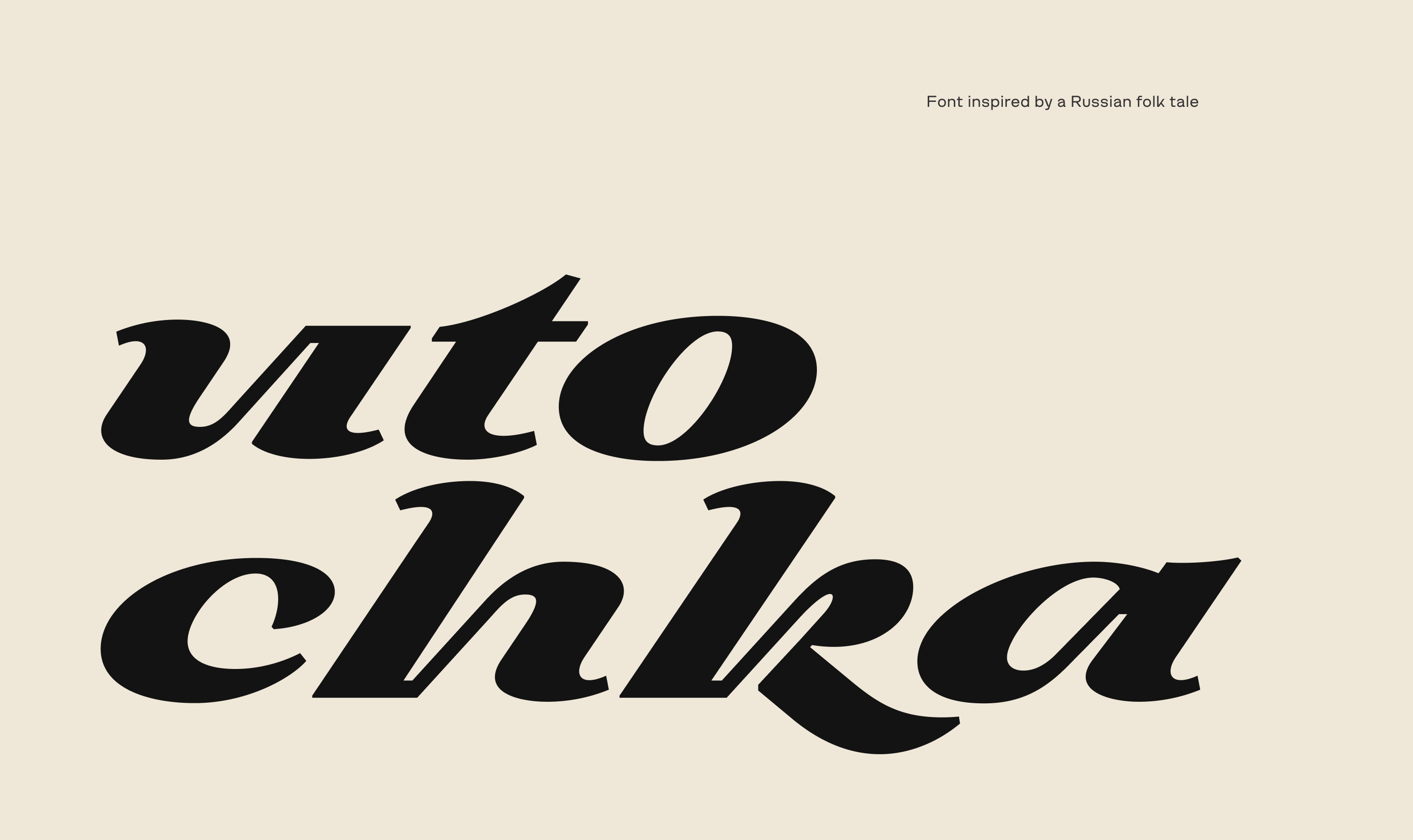
The Duck and its plastics was based on two criteria:
a) The physical qualities of a duck (soft, light, aerodynamic);
b) The personality traits and emotions the main character evokes (sweet, kind, beautiful, noble).
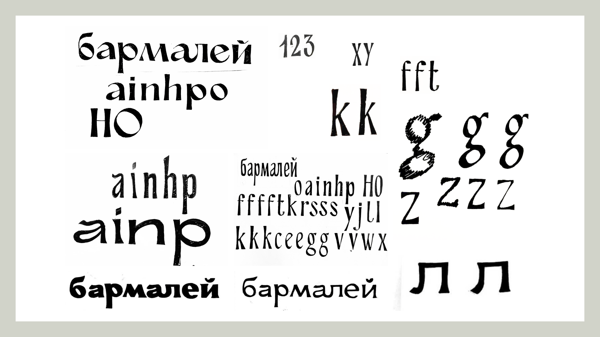
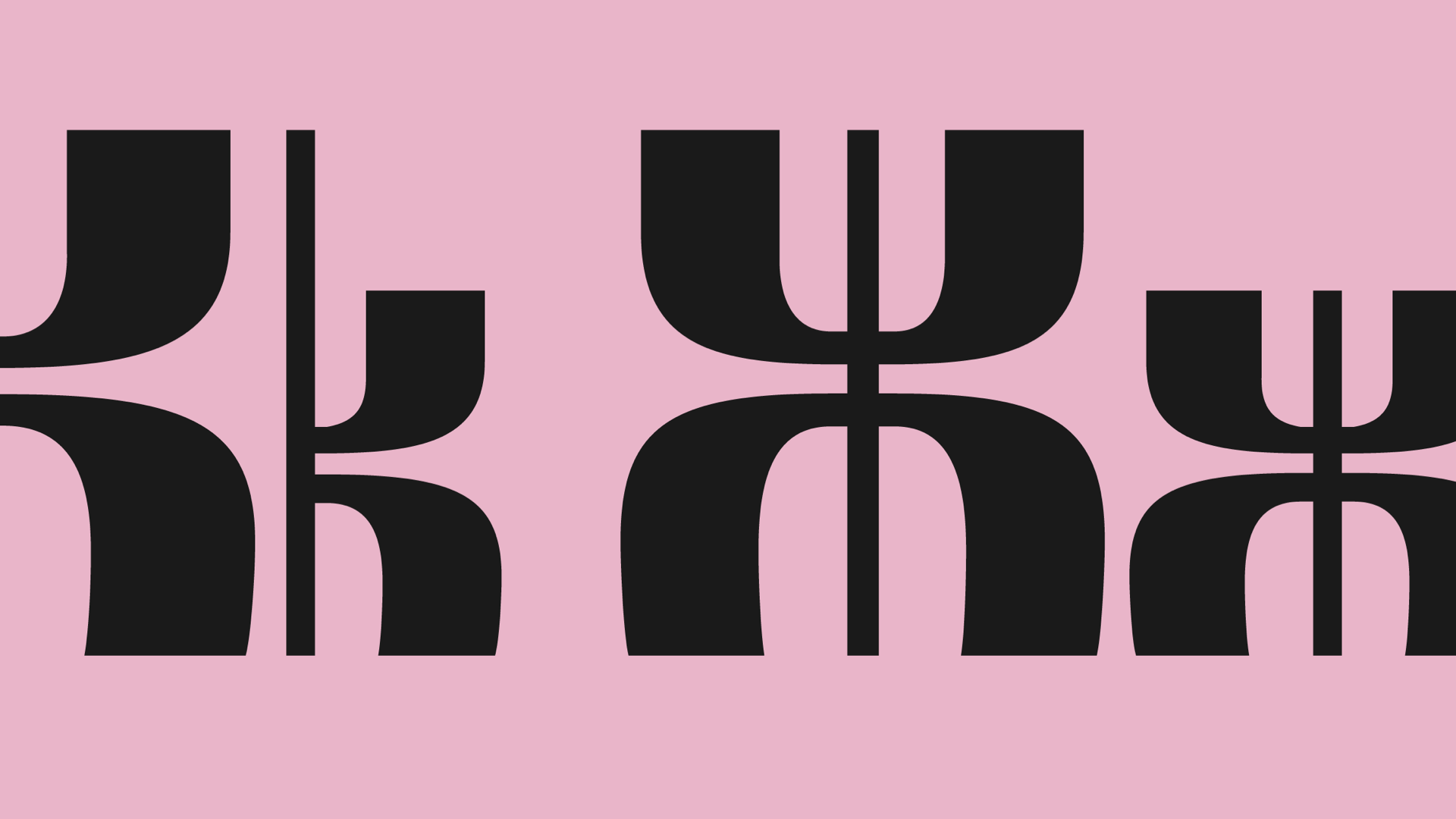
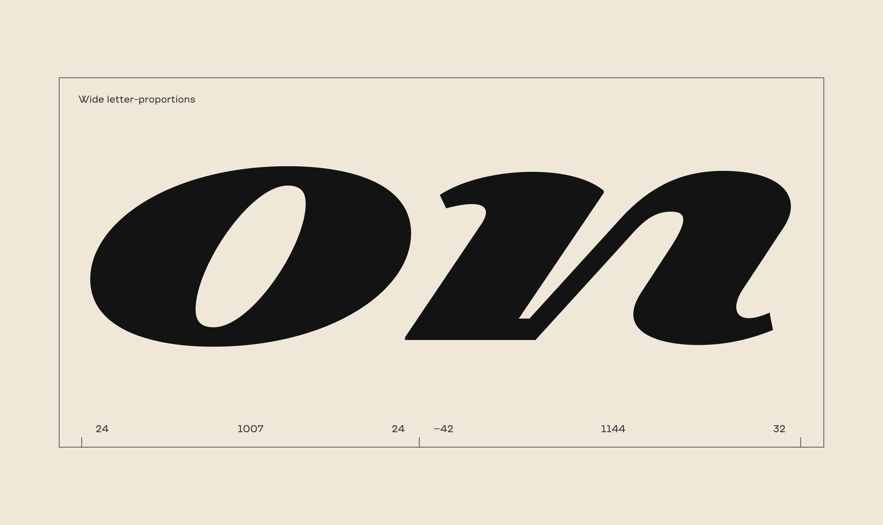
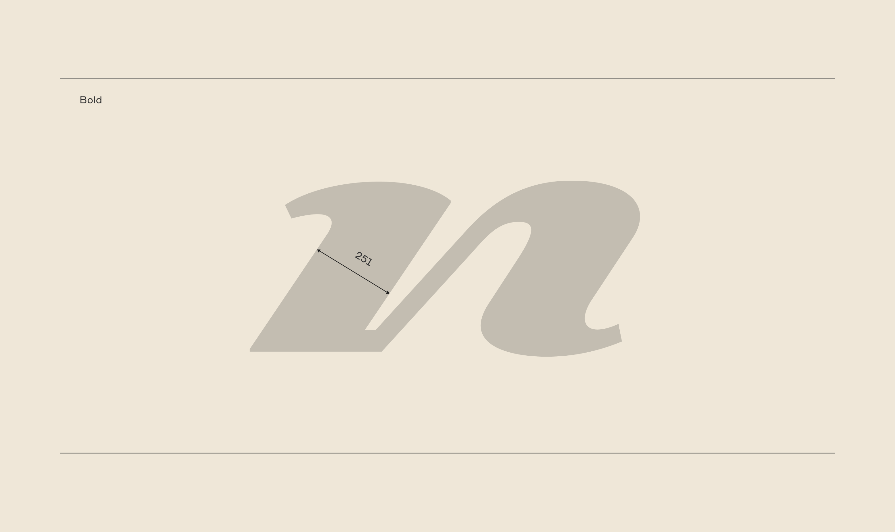
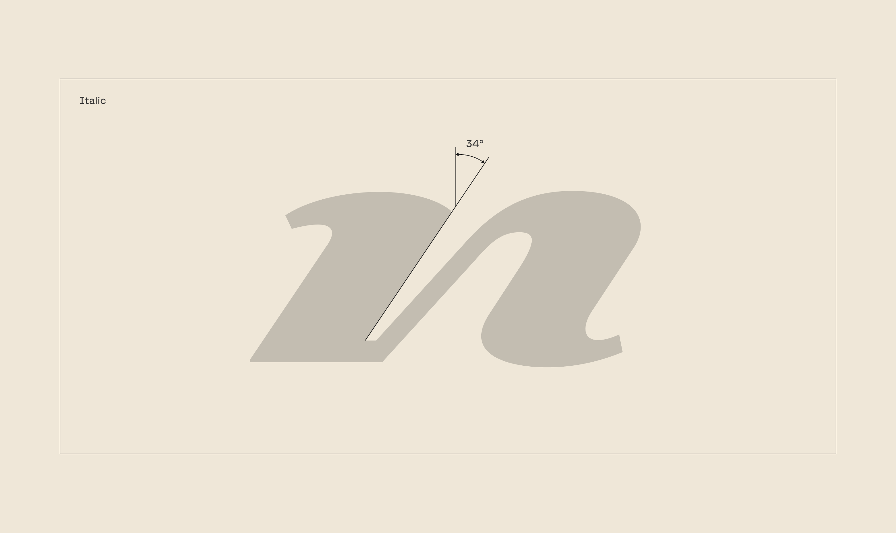
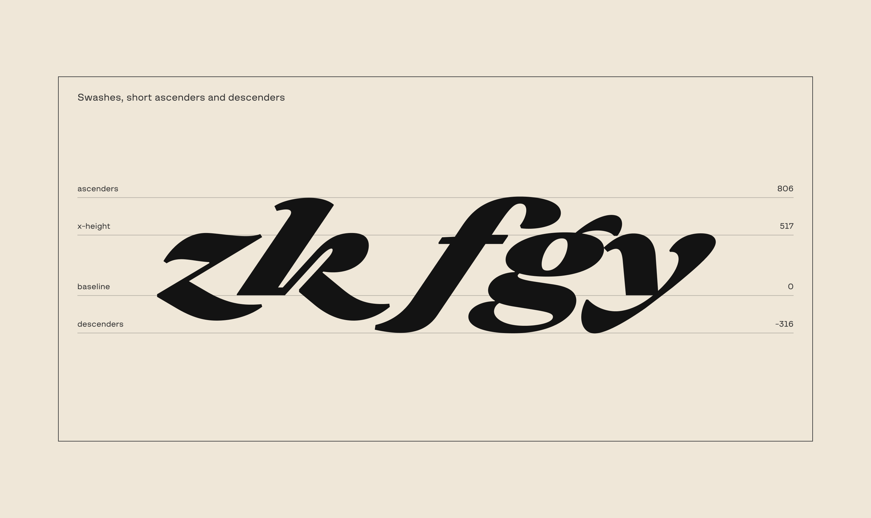
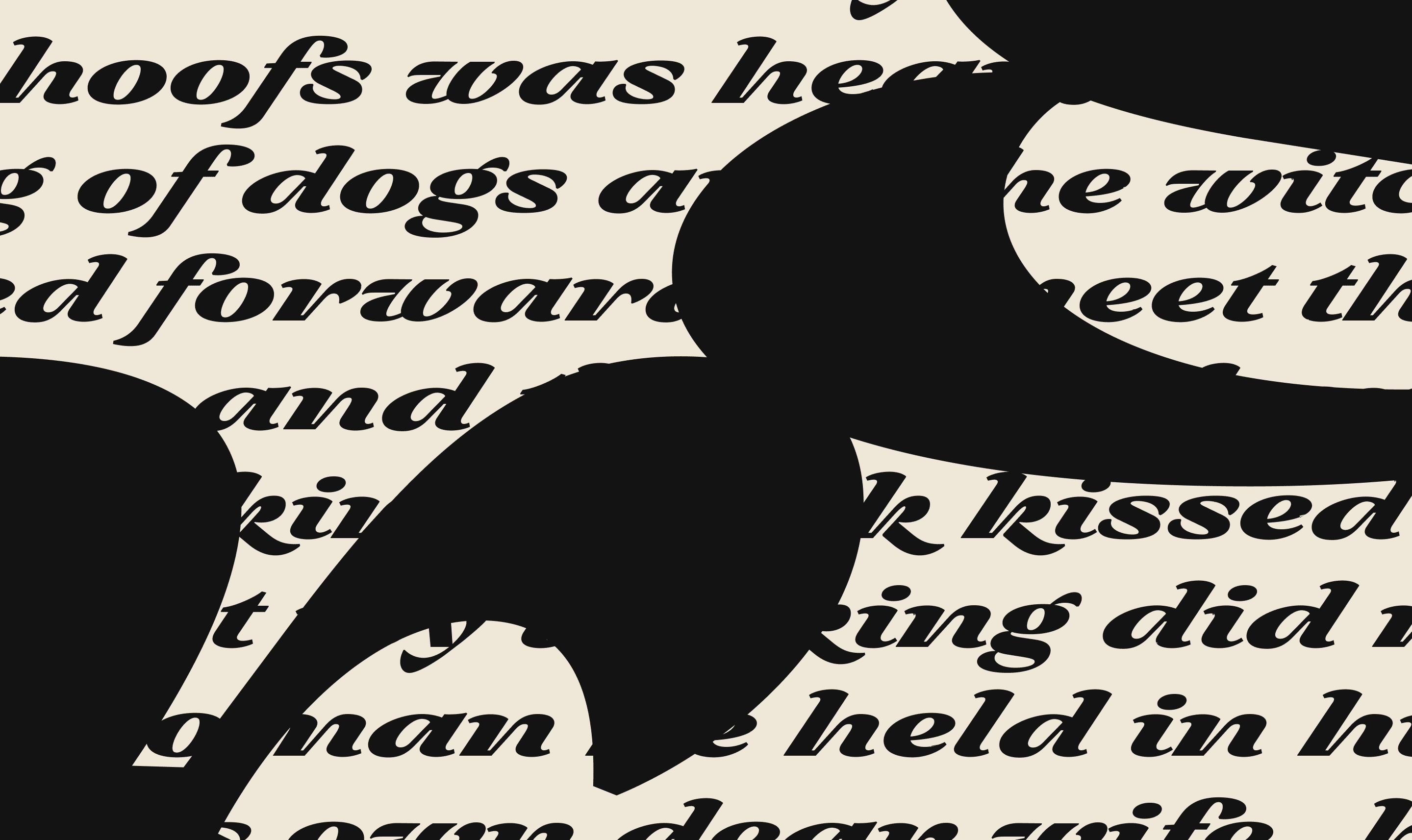
As a result: the constructions based on Italian cursive, wide proportions, wide inclination angles, shorter descenders and ascenders, bold style, an abundance of round elements. At times you get surprised by the unlikely strokes in k and z.
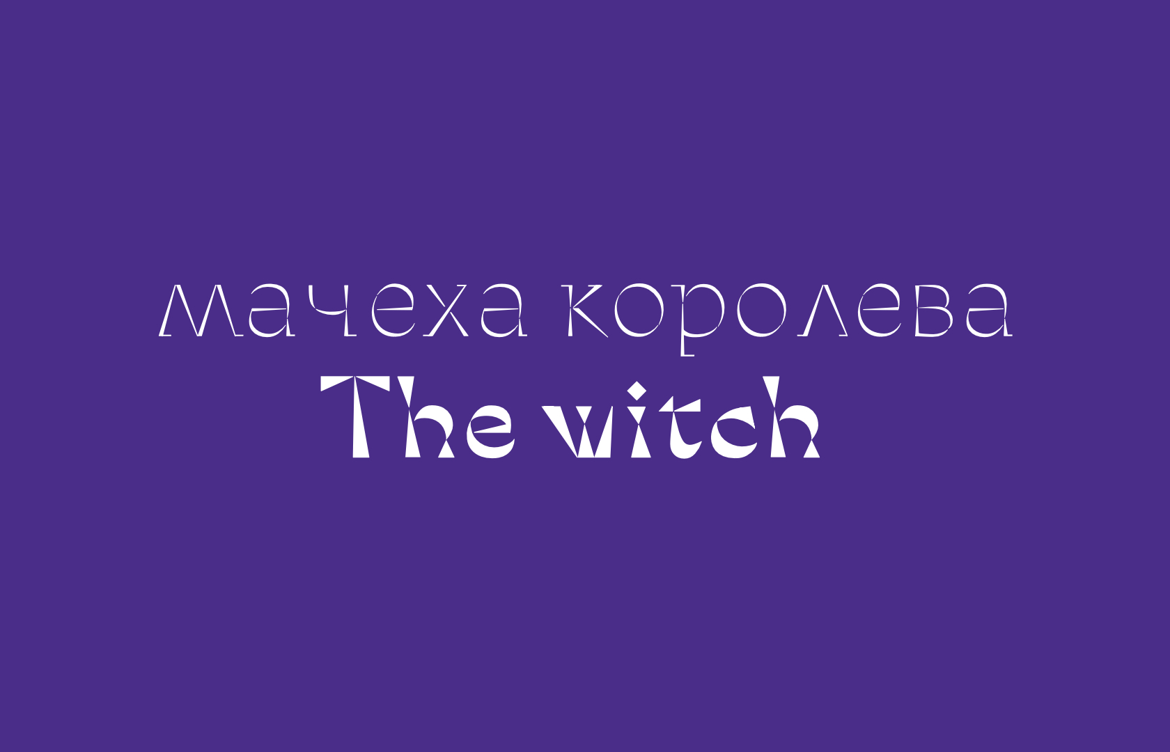
The witch was constructed based on the same principle. The result was a serif typeface with large, sharp serifs and slightly narrow proportions.
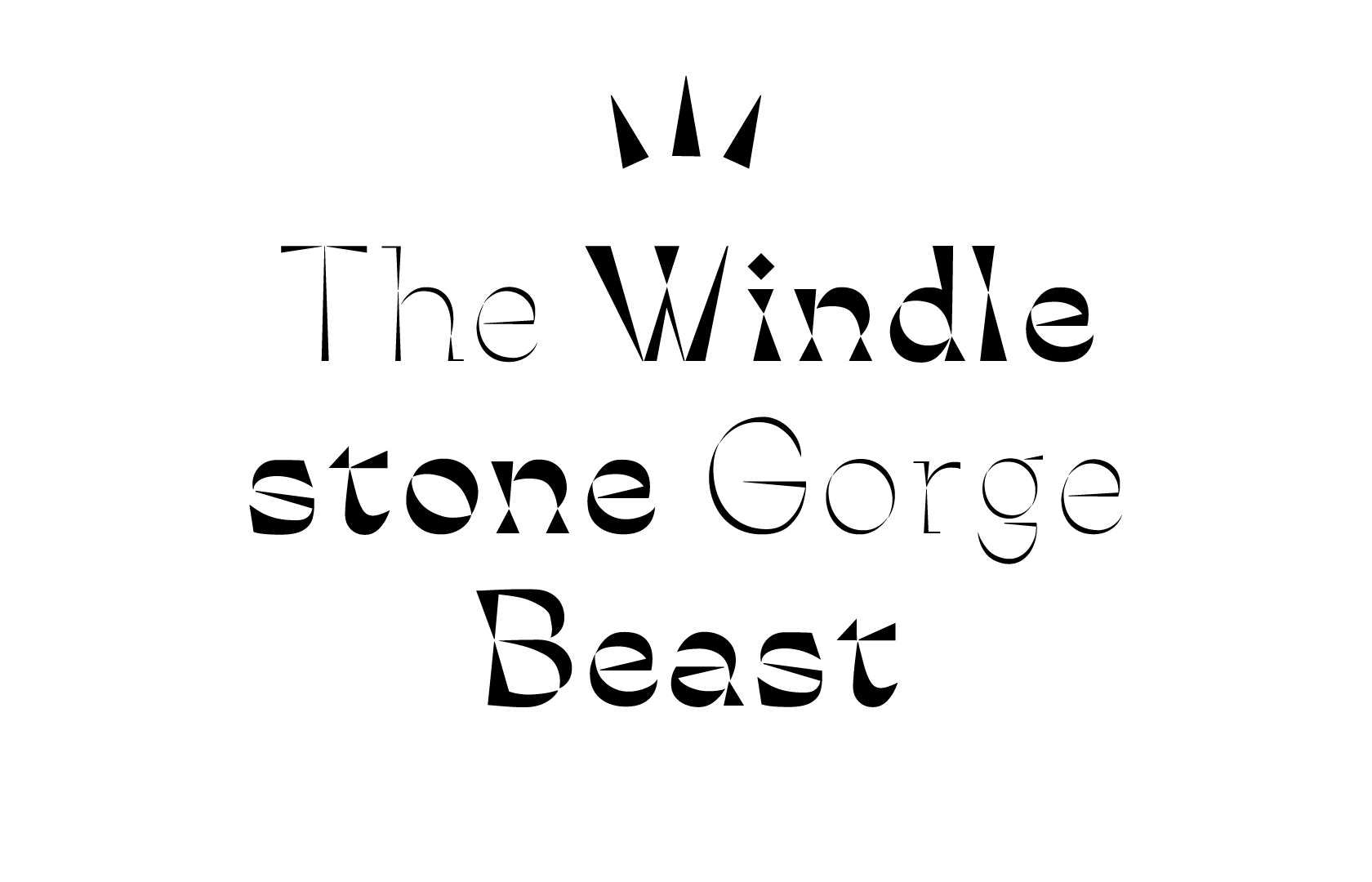
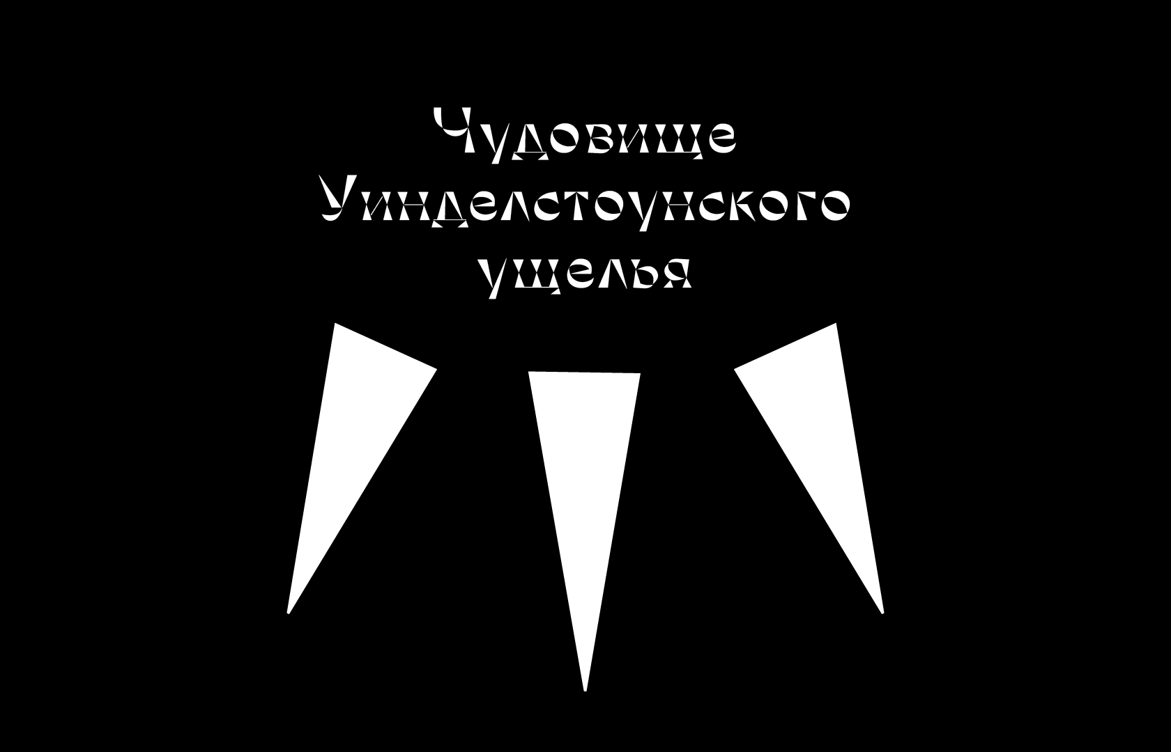
The project was based on the The Laidly Worm of Spindleston Heugh folk tale.
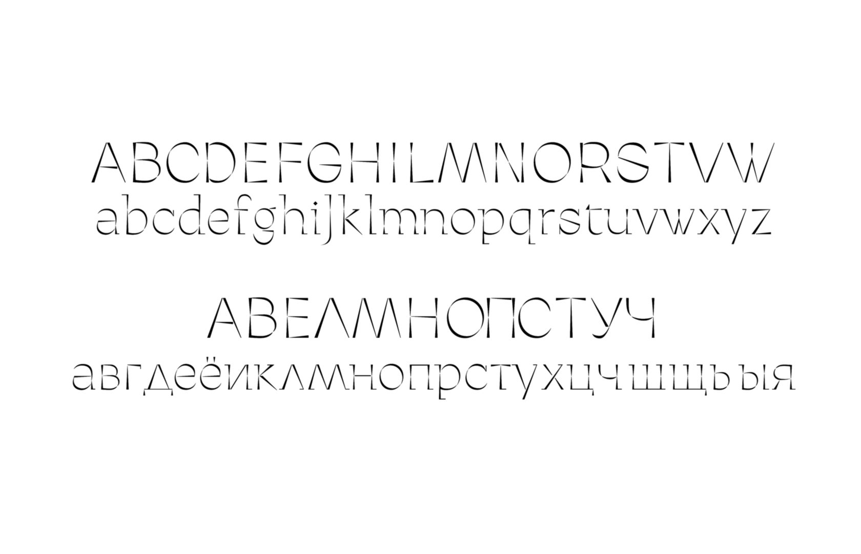
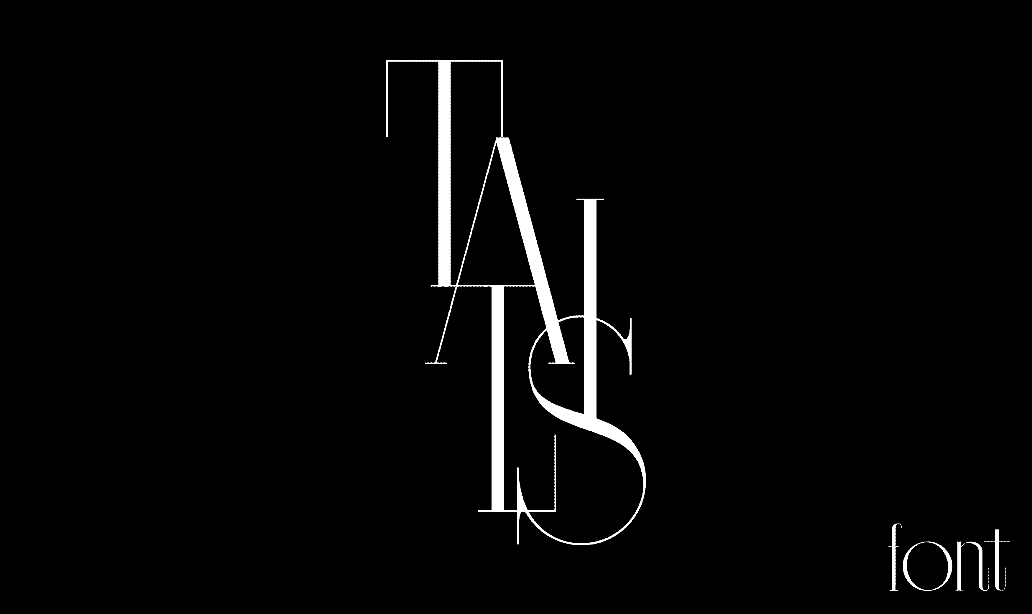
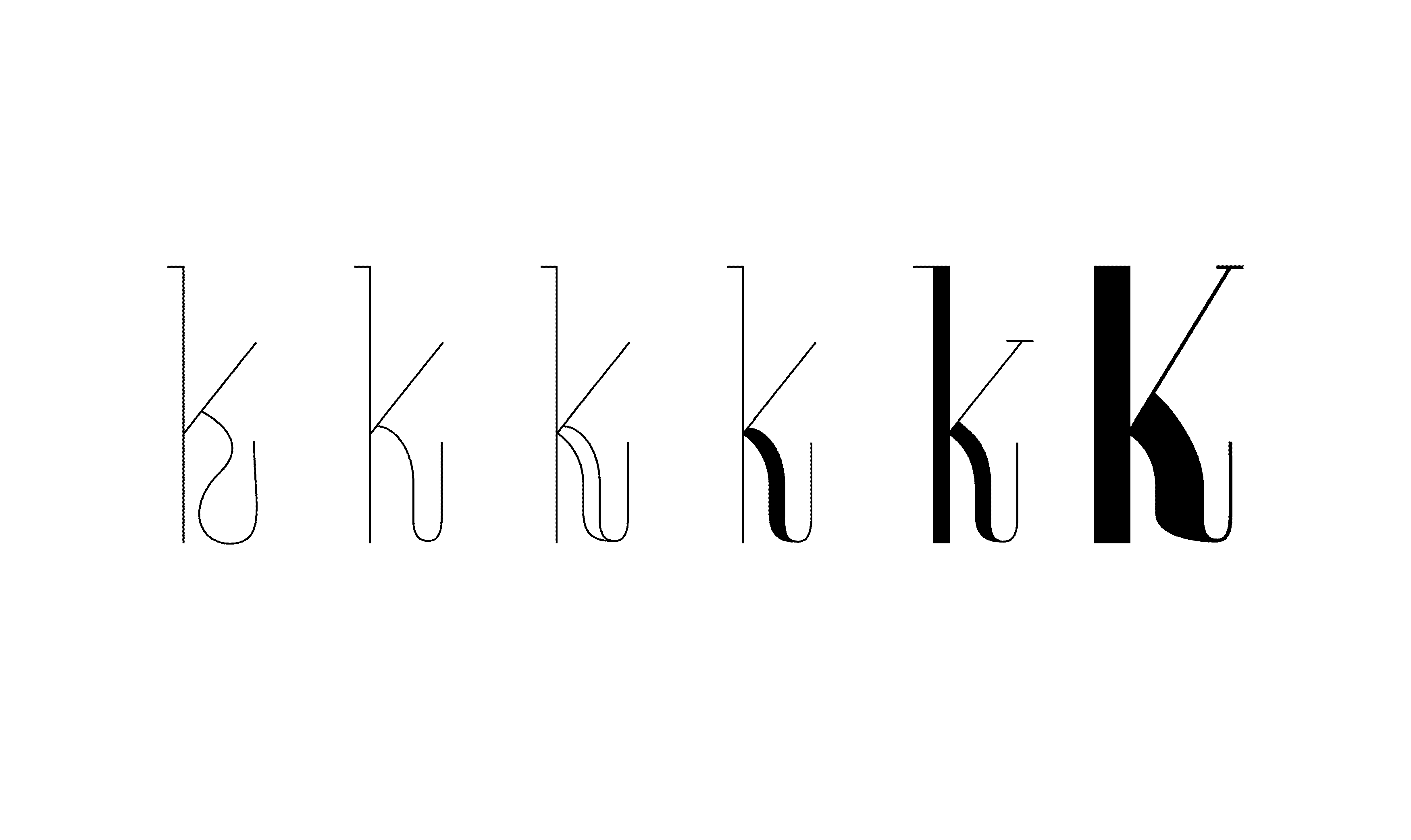
The project was based on Tails (rus. Хвосты)—Russian folk tale.
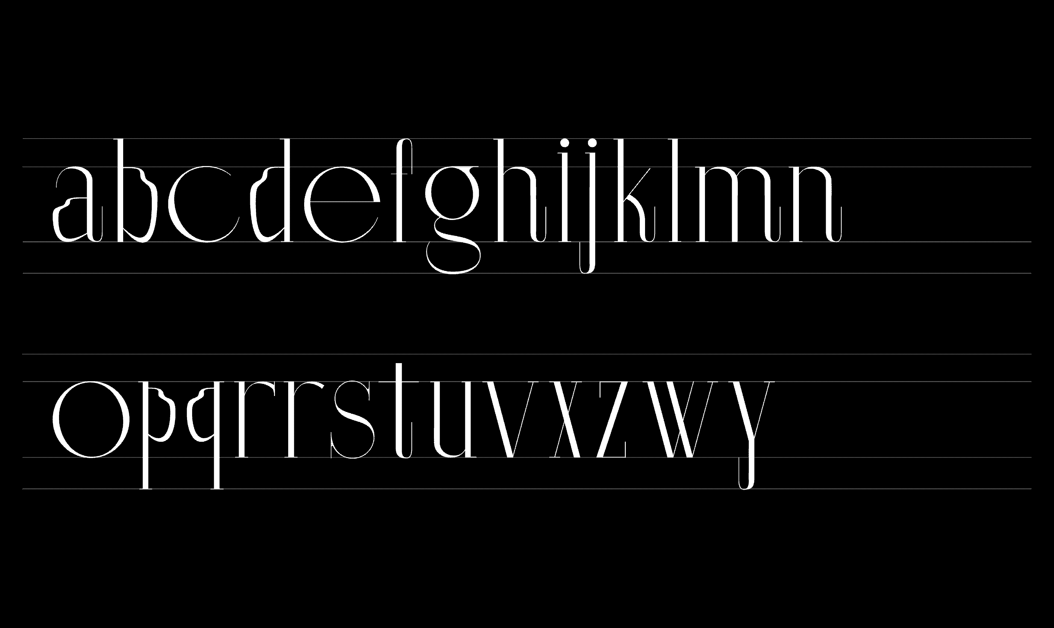


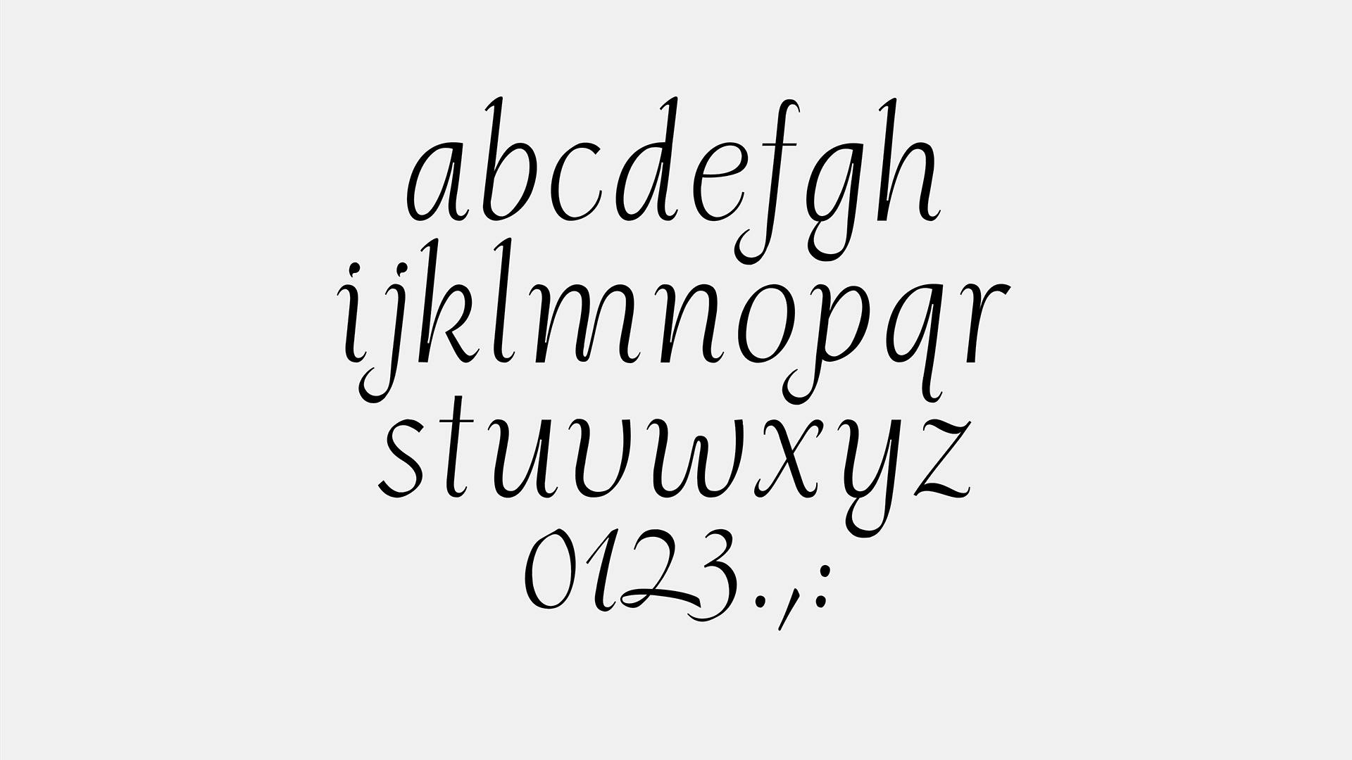
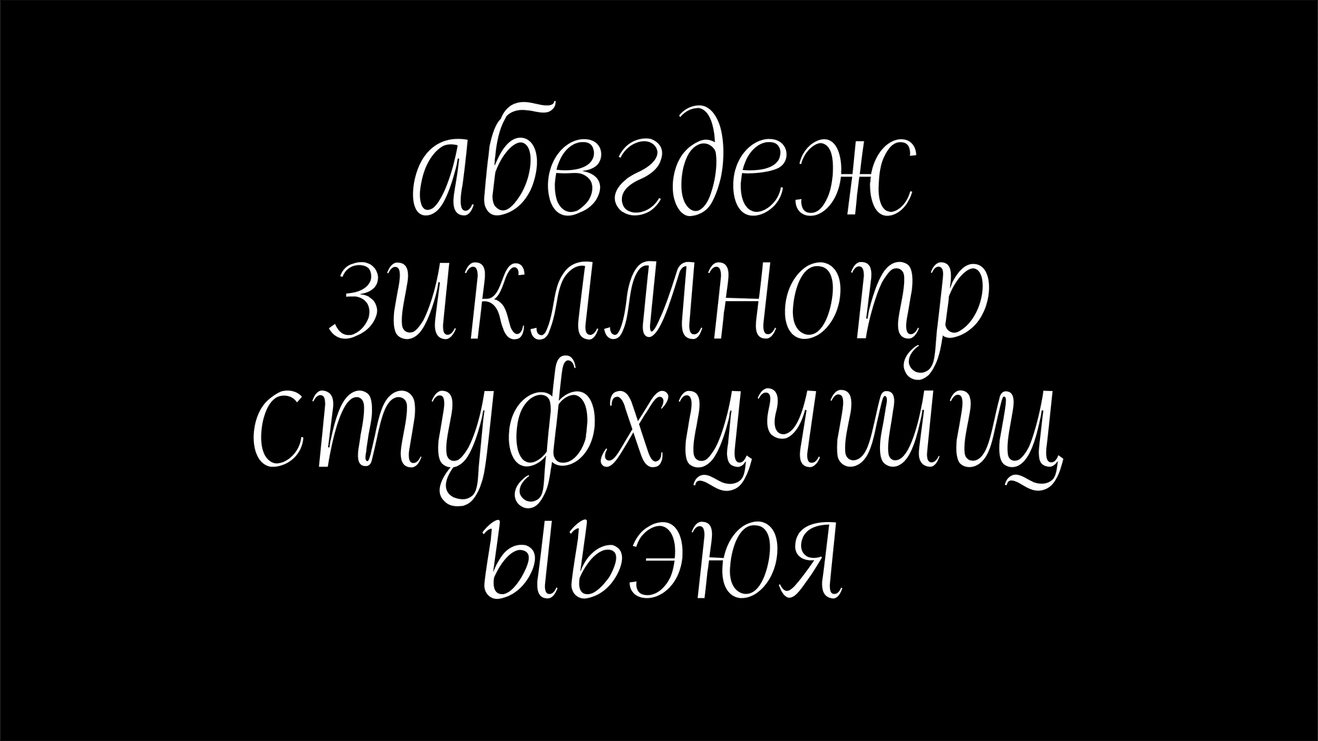
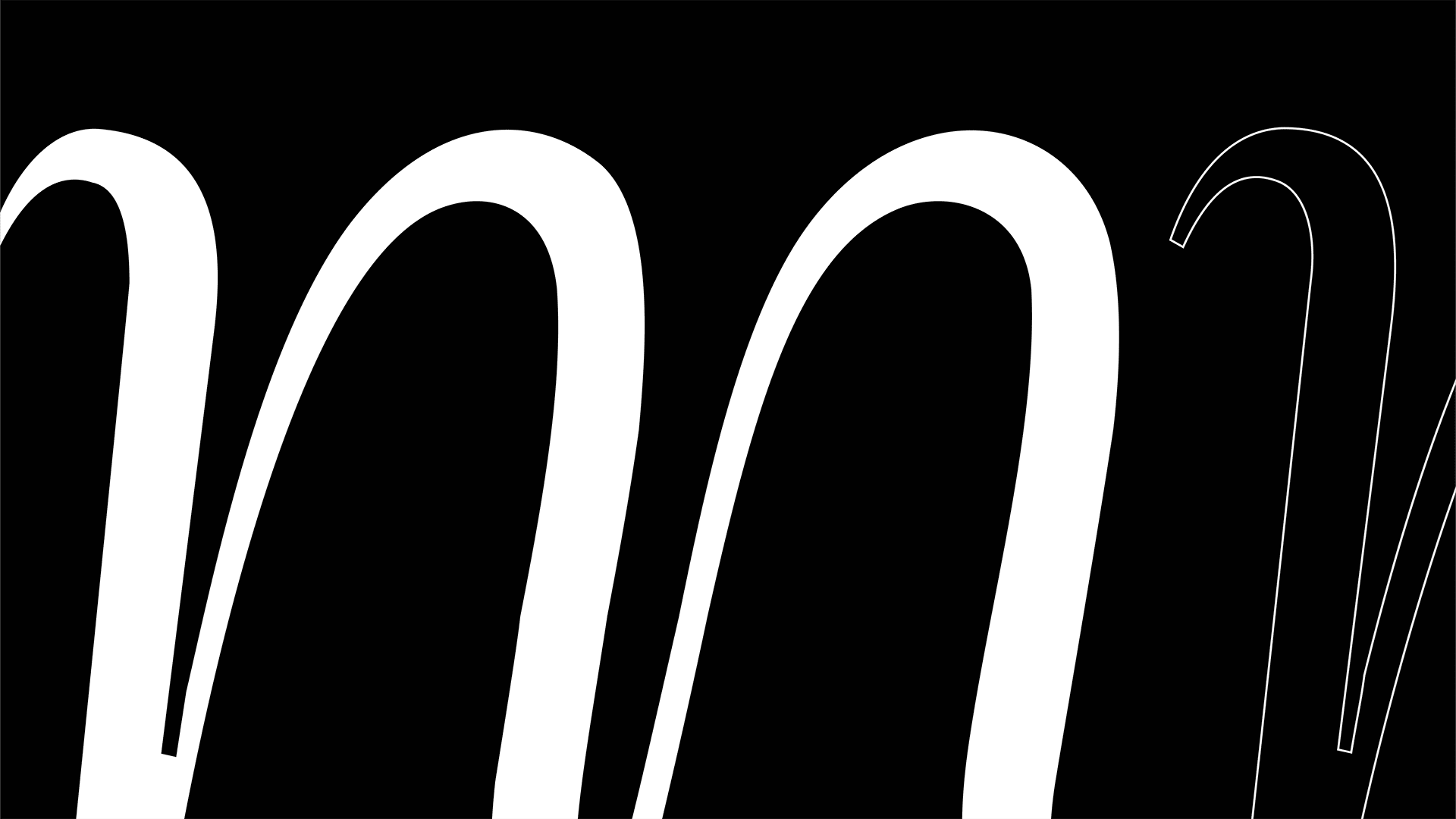
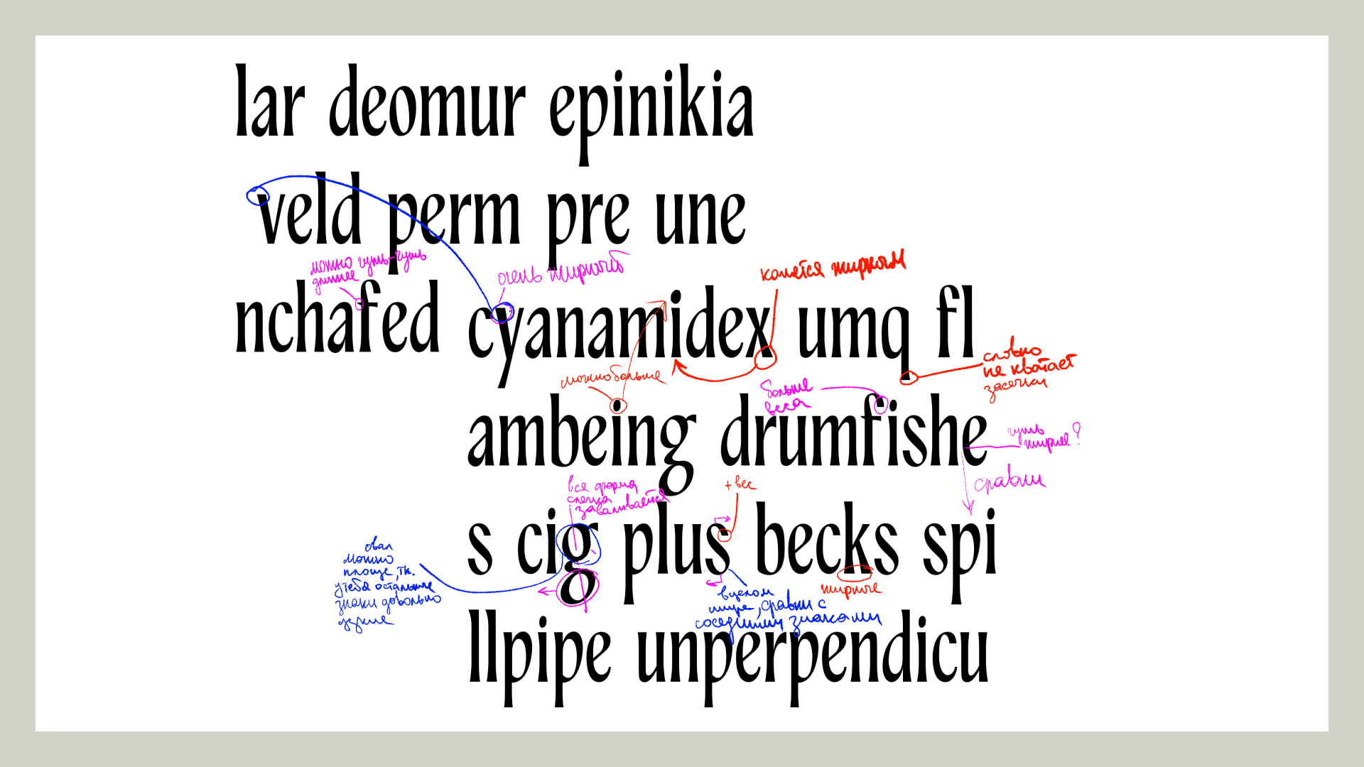
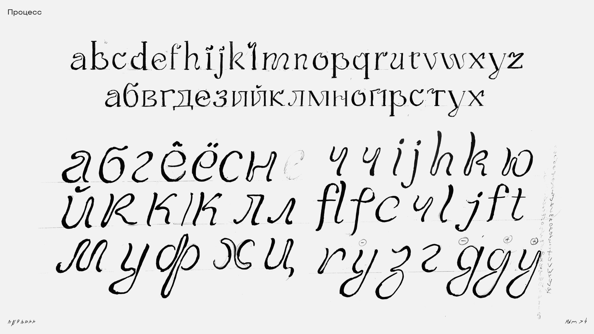
I named the typeface Ariel after the main character of the Little Mermaid fairytale. The calligraphy classes I had, have led me to a certain idea of a typeface, an image, and in my search for inspiration, I was looking for something close to the handwritten tradition, studying many examples of Italian cursive. I was trying to avoid jagged lines, to keep the form more fluid and lively. The underwater world became a separate source of inspiration for this type, as well as it had defined its overall style.
I have also created a few alternates and worked out the logic of how the typeface can become variable, defining ways in which the typeface may change based on its thickness, allowing it to convey various moods.